21st.dev 원본
Grid Pattern Card · Indie UI
카드 · MIT
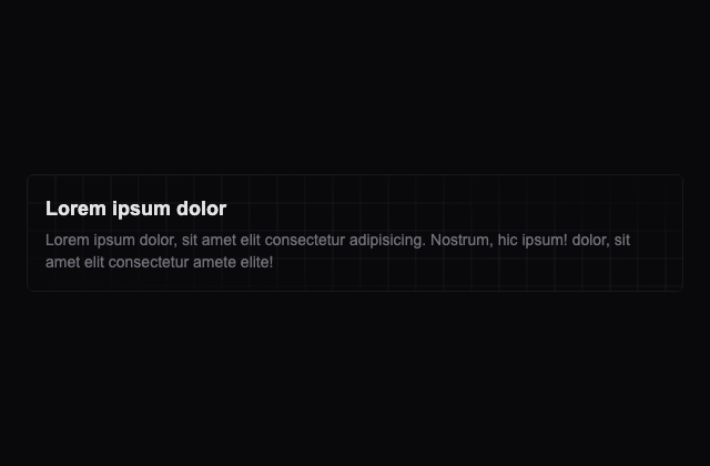
갤러리 안에서는 화면을 벗어나거나 움직임을 멈추면 예제도 닫힙니다. 다시 재생할 때는 처음부터 시작해요.
저장한 HTML에서는 갤러리의 재생 설정이 적용되지 않아요.
SOURCE FILES
원본 코드 읽기
수집한 원본 소스와 실행 안내를 함께 제공합니다. 실행 HTML에는 미리보기를 위한 실행 환경이 들어 있습니다.
author-variant-adapter.tsx실행 안내·자료
import { CardWithGrid, CardBody } from "@/components/cards/with-pattern";

// Exact composition from the author's Variant 8 Grid Preview block.
export default function AuthorVariantPreview() {
  return <CardWithGrid><CardBody /></CardWithGrid>;
}
author-example.tsx
import { cn } from '@/lib/utils';

const cardContent = {
  title: 'Lorem ipsum dolor',
  description:
    'Lorem ipsum dolor, sit amet elit consectetur adipisicing. Nostrum, hic ipsum! dolor, sit amet elit consectetur amete elite!',
};
export const CardBody = ({ className = '' }) => (
  <div className={cn('text-start p-4 md:p-6', className)}>
    <h3 className="text-lg font-bold mb-1 text-zinc-200">
      {cardContent.title}
    </h3>
    <p className="text-wrap text-zinc-500 text-sm">{cardContent.description}</p>
  </div>
);

//======================================
export const CardWithEllipsis = ({
  children,
}: {
  children: React.ReactNode;
}) => (
  <div className="border w-full rounded-md overflow-hidden border-zinc-900 bg-zinc-950 p-3">
    <div className="size-full bg-repeat bg-[url(/svg/ellipsis.svg)] bg-[length:30px_30px]">
      <div
        className={
          'size-full bg-gradient-to-tr from-zinc-950/90 via-zinc-950/40 to-zinc-950/10'
        }
      >
        {children}
      </div>
    </div>
  </div>
);

//======================================
export const CardWithGridEllipsis = ({
  children,
}: {
  children: React.ReactNode;
}) => (
  <div className="border w-full rounded-md overflow-hidden border-zinc-900 bg-zinc-950 p-1">
    <div className="size-full bg-repeat bg-[url(/svg/grid-ellipsis.svg)] bg-[length:25px_25px]">
      <div className="size-full bg-gradient-to-tr from-zinc-950 via-zinc-950/70 to-zinc-950">
        {children}
      </div>
    </div>
  </div>
);

//======================================
export const CardWithCircleEllipsis = ({
  children,
}: {
  children: React.ReactNode;
}) => (
  <div className="border w-full rounded-md overflow-hidden border-zinc-900 bg-zinc-950 p-1">
    <div
      className={`size-full bg-[url(/svg/circle-ellipsis.svg)] bg-repeat bg-[length:30px_30px]`}
    >
      <div className="size-full bg-gradient-to-tr from-zinc-950 via-zinc-950/80 to-zinc-900/10">
        {children}
      </div>
    </div>
  </div>
);

//======================================
export const CardWithLines = ({ children }: { children: React.ReactNode }) => (
  <div className="border w-full rounded-md overflow-hidden border-zinc-900 bg-zinc-950 p-[1px]">
    <div className="bg-[url(/svg/lines.svg)] bg-[length:40px_40px] size-full bg-repeat rounded-md">
      <div className="size-full bg-gradient-to-tr from-zinc-950 via-zinc-950/80 to-zinc-900/40">
        {children}
      </div>
    </div>
  </div>
);
//======================================
export const CardWithPlus = ({ children }: { children: React.ReactNode }) => {
  return (
    <div className="border w-full rounded-md overflow-hidden dark:border-zinc-900 bg-zinc-950">
      <div className="size-full bg-[url(/svg/plus.svg)] bg-repeat bg-[length:65px_65px]">
        <div className="size-full bg-gradient-to-tr from-zinc-950 via-zinc-950/[0.93] to-zinc-950">
          {children}
        </div>
      </div>
    </div>
  );
};
//======================================
export const CardWithSquareX = ({
  children,
}: {
  children: React.ReactNode;
}) => (
  <div className="border w-full rounded-md overflow-hidden dark:border-zinc-900 bg-zinc-950">
    <div className="size-full bg-[url(/svg/square-x.svg)] bg-repeat bg-[length:95px_95px]">
      <div className="size-full bg-gradient-to-tr from-zinc-950 via-zinc-950/[0.93] to-zinc-950">
        {children}
      </div>
    </div>
  </div>
);
//======================================
export const CardWithGrid = ({ children }: { children: React.ReactNode }) => (
  <div className="border w-full rounded-md overflow-hidden dark:border-zinc-900 bg-zinc-950">
    <div className="size-full bg-[url(/svg/grid.svg)] bg-repeat bg-[length:50px_50px]">
      <div className="size-full bg-gradient-to-tr from-zinc-950 via-zinc-950/[.85] to-zinc-950">
        {children}
      </div>
    </div>
  </div>
);

//======================================
export const CardWithNoise = ({ children }: { children: React.ReactNode }) => (
  <div className="border w-full rounded-md overflow-hidden dark:border-zinc-900 bg-zinc-950">
    <div
      className={`size-full bg-[url(/svg/noise.svg)] bg-repeat bg-[length:500px_500px]`}
    >
      <div className="bg-zinc-950/30">{children}</div>
    </div>
  </div>
);
함께 쓰는 파일 13개 보기
LICENSE
# MIT License

Copyright (c) Indie UI

Permission is hereby granted, free of charge, to any person obtaining a copy
of this software and associated documentation files (the "Software"), to deal
in the Software without restriction, including without limitation the rights
to use, copy, modify, merge, publish, distribute, sublicense, and/or sell
copies of the Software, and to permit persons to whom the Software is
furnished to do so, subject to the following conditions:

The above copyright notice and this permission notice shall be included in all
copies or substantial portions of the Software.

THE SOFTWARE IS PROVIDED "AS IS", WITHOUT WARRANTY OF ANY KIND, EXPRESS OR
IMPLIED, INCLUDING BUT NOT LIMITED TO THE WARRANTIES OF MERCHANTABILITY,
FITNESS FOR A PARTICULAR PURPOSE AND NONINFRINGEMENT. IN NO EVENT SHALL THE
AUTHORS OR COPYRIGHT HOLDERS BE LIABLE FOR ANY CLAIM, DAMAGES OR OTHER
LIABILITY, WHETHER IN AN ACTION OF CONTRACT, TORT OR OTHERWISE, ARISING FROM,
OUT OF OR IN CONNECTION WITH THE SOFTWARE OR THE USE OR OTHER DEALINGS IN THE
SOFTWARE.
upstream/content/docs/cards-with-pattern.mdx
---
title: Cards with Pattern
description: Collection of cards with patterns
---
import { Tab, Tabs } from 'fumadocs-ui/components/tabs';
import {
  CardBody,
  CardWithCircleEllipsis,
  CardWithEllipsis,
  CardWithGrid,
  CardWithGridEllipsis,
  CardWithLines,
  CardWithPlus,
  CardWithSquareX,
  CardWithNoise,
} from '@/components/cards/with-pattern';
import { WithContributor } from '@/components/with-contributor';


To use a custom SVG pattern in your project, you have two options:

1. **Copy an Existing SVG**: Every has a link to the SVG pattern. You can copy the SVG pattern and use it in your project.

2. **Generate a New SVG**: If you prefer a unique pattern or need a pattern, you can create your own SVG. I use [FFFUEL](https://www.fffuel.co/ooorganize/) to generate SVG patterns.

## Variant 1 Ellipsis

Copy [SVG pattern](https://github.com/Ali-Hussein-dev/indie-ui/tree/main/public/svg/ellipsis.svg)

<Tabs items={['Preview', 'React']}>
<Tab value="preview">
  <WithContributor contributorKey={"aliHussein"} className="max-w-xl mx-auto">
        <CardWithEllipsis>
            <CardBody />
        </CardWithEllipsis>
  </WithContributor>

</Tab>
<Tab value="React">
```tsx	title="card.tsx"
import { cn } from '@/lib/utils';

const cardContent = {
  title: 'Lorem ipsum dolor',
  description:
    'Lorem ipsum dolor, sit amet elit consectetur adipisicing. Nostrum, hic ipsum! dolor, sit amet elit consectetur amete elite!',
};
export const CardBody = ({ className = '' }) => (
  <div className={cn('text-start p-4 md:p-6', className)}>
    <h3 className="text-lg font-bold mb-1 text-zinc-200">
      {cardContent.title}
    </h3>
    <p className="text-wrap text-zinc-500 text-sm">{cardContent.description}</p>
  </div>
);
//======================================
export const CardWithEllipsis = ({
  children,
}: {
  children: React.ReactNode;
}) => (
    <div className="border w-full rounded-md overflow-hidden dark:border-zinc-900 dark:bg-zinc-950 p-3">
      <div className="size-full bg-repeat bg-[url(/svg/ellipsis.svg)] bg-[length:30px_30px]">
        <div
          className={
            'size-full bg-gradient-to-tr from-zinc-950/90 via-zinc-950/40 to-zinc-950/10'
          }
        >
          {children}
        </div>
      </div>
    </div>
  );
```
</Tab>
</Tabs>
## Variant 2 Grid ellipsis

Copy [SVG pattern](https://github.com/Ali-Hussein-dev/indie-ui/tree/main/public/svg/grid-ellipsis.svg)

<Tabs items={['Preview', 'React']}>
<Tab value="preview">
<WithContributor contributorKey={"aliHussein"} className="max-w-xl mx-auto">
        <CardWithGridEllipsis>
            <CardBody />
        </CardWithGridEllipsis>
  </WithContributor>
</Tab>
<Tab value="React">
```tsx	title="card.tsx"
import { cn } from '@/lib/utils';
const cardContent = {
  title: 'Lorem ipsum dolor',
  description:
    'Lorem ipsum dolor, sit amet elit consectetur adipisicing. Nostrum, hic ipsum! dolor, sit amet elit consectetur amete elite!',
};
export const CardBody = ({ className = '' }) => (
  <div className={cn('text-start p-4 md:p-6', className)}>
    <h3 className="text-lg font-bold mb-1 text-zinc-200">
      {cardContent.title}
    </h3>
    <p className="text-wrap text-zinc-500 text-sm">{cardContent.description}</p>
  </div>
);
//======================================
export const CardWithGridEllipsis = ({ children }: { children: React.ReactNode }) => (
    <div className="border w-full rounded-md overflow-hidden dark:border-zinc-900 dark:bg-zinc-950 p-1">
      <div className="size-full bg-repeat bg-[url(/svg/grid-ellipsis.svg)] bg-[length:25px_25px]">
        <div className="size-full bg-gradient-to-tr from-zinc-950 via-zinc-950/70 to-zinc-950">
          {children}
        </div>
      </div>
    </div>
  );
```
</Tab>
</Tabs>

## Variant 3 Circle ellipsis
Copy [SVG pattern](https://github.com/Ali-Hussein-dev/indie-ui/tree/main/public/svg/circle-ellipsis.svg)

<Tabs items={['Preview', 'React']}>
<Tab value="preview">
<WithContributor contributorKey={"aliHussein"} className="max-w-xl mx-auto">
        <CardWithCircleEllipsis>
            <CardBody />
        </CardWithCircleEllipsis>
  </WithContributor>
</Tab>
<Tab value="React">
```tsx	title="card.tsx"
import { cn } from '@/lib/utils';
const cardContent = {
  title: 'Lorem ipsum dolor',
  description:
    'Lorem ipsum dolor, sit amet elit consectetur adipisicing. Nostrum, hic ipsum! dolor, sit amet elit consectetur amete elite!',
};
export const CardBody = ({ className = '' }) => (
  <div className={cn('text-start p-4 md:p-6', className)}>
    <h3 className="text-lg font-bold mb-1 text-zinc-200">
      {cardContent.title}
    </h3>
    <p className="text-wrap text-zinc-500 text-sm">{cardContent.description}</p>
  </div>
);
//======================================
export const CardWithGridEllipsis = ({ children }: { children: React.ReactNode }) => (
    <div className="border w-full rounded-md overflow-hidden dark:border-zinc-900 bg-zinc-950 p-1">
      <div
        className={`size-full bg-[url(/svg/circle-ellipsis.svg)] bg-repeat bg-[length:30px_30px]`}
      >
        <div className="size-full bg-gradient-to-tr from-zinc-950 via-zinc-950/80 to-zinc-900/10">
          {children}
        </div>
      </div>
    </div>
  );
```
</Tab>
</Tabs>

## Variant 4 Lines
Copy [SVG pattern](https://github.com/Ali-Hussein-dev/indie-ui/tree/main/public/svg/lines.svg)

<Tabs items={['Preview', 'React']}>
<Tab value="preview">
<WithContributor contributorKey={"aliHussein"} className="max-w-xl mx-auto">
        <CardWithLines>
            <CardBody />
        </CardWithLines>
  </WithContributor>
</Tab>
<Tab value="React">
```tsx	title="card.tsx"
import { cn } from '@/lib/utils';
const cardContent = {
  title: 'Lorem ipsum dolor',
  description:
    'Lorem ipsum dolor, sit amet elit consectetur adipisicing. Nostrum, hic ipsum! dolor, sit amet elit consectetur amete elite!',
};
export const CardBody = ({ className = '' }) => (
  <div className={cn('text-start p-4 md:p-6', className)}>
    <h3 className="text-lg font-bold mb-1 text-zinc-200">
      {cardContent.title}
    </h3>
    <p className="text-wrap text-zinc-500 text-sm">{cardContent.description}</p>
  </div>
);
//======================================
export const CardWithLines = ({ children }: { children: React.ReactNode }) => {
  return (
    <div className="border w-full rounded-md overflow-hidden dark:border-zinc-900 bg-zinc-950 p-1">
      <div
        className={`size-full bg-[url(/svg/circle-ellipsis.svg)] bg-repeat bg-[length:30px_30px]`}
      >
        <div className="size-full bg-gradient-to-tr from-zinc-950 via-zinc-950/80 to-zinc-900/10">
          {children}
        </div>
      </div>
    </div>
  );
};
```
</Tab>
</Tabs>

## Variant 5 Pluses
Copy [SVG pattern](https://github.com/Ali-Hussein-dev/indie-ui/tree/main/public/svg/plus.svg)

<Tabs items={['Preview', 'React']}>
<Tab value="preview">
  <WithContributor contributorKey={"aliHussein"} className="max-w-xl mx-auto">
        <CardWithPlus>
            <CardBody />
        </CardWithPlus>
  </WithContributor>
</Tab>
<Tab value="React">
```tsx	title="card.tsx"
import { cn } from '@/lib/utils';
const cardContent = {
  title: 'Lorem ipsum dolor',
  description:
    'Lorem ipsum dolor, sit amet elit consectetur adipisicing. Nostrum, hic ipsum! dolor, sit amet elit consectetur amete elite!',
};
export const CardBody = ({ className = '' }) => (
  <div className={cn('text-start p-4 md:p-6', className)}>
    <h3 className="text-lg font-bold mb-1 text-zinc-200">
      {cardContent.title}
    </h3>
    <p className="text-wrap text-zinc-500 text-sm">{cardContent.description}</p>
  </div>
);
//======================================
export const CardWithPlus = ({ children }: { children: React.ReactNode }) => {
  return (<div className="border w-full rounded-md overflow-hidden dark:border-zinc-900 bg-zinc-950">
      <div className="size-full bg-[url(/svg/plus.svg)] bg-repeat bg-[length:65px_65px]">
        <div className="size-full bg-gradient-to-tr from-zinc-950 via-zinc-950/[0.93] to-zinc-950">
          {children}
        </div>
      </div>
    </div>);
};
```
</Tab>
</Tabs>

## Variant 6 Square X
Copy [SVG pattern](https://github.com/Ali-Hussein-dev/indie-ui/tree/main/public/svg/square-x.svg)

<Tabs items={['Preview', 'React']}>
<Tab value="preview">
<WithContributor contributorKey={"aliHussein"} className="max-w-xl mx-auto">
        <CardWithSquareX>
            <CardBody />
        </CardWithSquareX>
  </WithContributor>
</Tab>
<Tab value="React">
```tsx	title="card.tsx"
import { cn } from '@/lib/utils';
const cardContent = {
  title: 'Lorem ipsum dolor',
  description:
    'Lorem ipsum dolor, sit amet elit consectetur adipisicing. Nostrum, hic ipsum! dolor, sit amet elit consectetur amete elite!',
};
export const CardBody = ({ className = '' }) => (
  <div className={cn('text-start p-4 md:p-6', className)}>
    <h3 className="text-lg font-bold mb-1 text-zinc-200">
      {cardContent.title}
    </h3>
    <p className="text-wrap text-zinc-500 text-sm">{cardContent.description}</p>
  </div>
);
//======================================
export const CardWithSquareX = ({ children }: { children: React.ReactNode }) => (
    <div className="border w-full rounded-md overflow-hidden dark:border-zinc-900 bg-zinc-950">
      <div className="size-full bg-[url(/svg/square-x.svg)] bg-repeat bg-[length:95px_95px]">
        <div className="size-full bg-gradient-to-tr from-zinc-950 via-zinc-950/[0.93] to-zinc-950">
          {children}
        </div>
      </div>
    </div>
  );
```
</Tab>
</Tabs>
## Variant 8 Grid
Copy [SVG pattern](https://github.com/Ali-Hussein-dev/indie-ui/tree/main/public/svg/grid.svg)

<Tabs items={['Preview', 'React']}>
<Tab value="preview">
<WithContributor contributorKey={"aliHussein"} className="max-w-xl mx-auto">
        <CardWithGrid>
            <CardBody />
        </CardWithGrid>
  </WithContributor>
</Tab>
<Tab value="React">
```tsx	title="card.tsx"
import { cn } from '@/lib/utils';
const cardContent = {
  title: 'Lorem ipsum dolor',
  description:
    'Lorem ipsum dolor, sit amet elit consectetur adipisicing. Nostrum, hic ipsum! dolor, sit amet elit consectetur amete elite!',
};
export const CardBody = ({ className = '' }) => (
  <div className={cn('text-start p-4 md:p-6', className)}>
    <h3 className="text-lg font-bold mb-1 text-zinc-200">
      {cardContent.title}
    </h3>
    <p className="text-wrap text-zinc-500 text-sm">{cardContent.description}</p>
  </div>
);
//======================================
export const CardWithGrid = ({ children }) => (
  <div className="border w-full rounded-md overflow-hidden dark:border-zinc-900 bg-zinc-950">
    <div className="size-full bg-[url(/svg/grid.svg)] bg-repeat bg-[length:50px_50px]">
      <div className="size-full bg-gradient-to-tr from-zinc-950 via-zinc-950/[.85] to-zinc-950">
        {children}
      </div>
    </div>
  </div>
);
```
</Tab>
</Tabs>
## Variant 7 Noise

Copy [SVG pattern](https://github.com/Ali-Hussein-dev/indie-ui/tree/main/public/svg/noise.svg)

<Tabs items={['Preview', 'React']}>
<Tab value="preview">
<WithContributor contributorKey={"aliHussein"} className="max-w-xl mx-auto">
        <CardWithNoise>
            <CardBody />
        </CardWithNoise>
  </WithContributor>
</Tab>
<Tab value="React">
```tsx	title="card.tsx"
import { cn } from '@/lib/utils';
const cardContent = {
  title: 'Lorem ipsum dolor',
  description:
    'Lorem ipsum dolor, sit amet elit consectetur adipisicing. Nostrum, hic ipsum! dolor, sit amet elit consectetur amete elite!',
};
export const CardBody = ({ className = '' }) => (
  <div className={cn('text-start p-4 md:p-6', className)}>
    <h3 className="text-lg font-bold mb-1 text-zinc-200">
      {cardContent.title}
    </h3>
    <p className="text-wrap text-zinc-500 text-sm">{cardContent.description}</p>
  </div>
);
//======================================
export const CardWithNoise = ({ children }) => (
  <div className="border w-full rounded-md overflow-hidden dark:border-zinc-900 bg-zinc-950">
    <div
      className={`size-full bg-[url(/svg/noise.svg)] bg-repeat bg-[length:500px_500px]`}
    >
      <div className="bg-zinc-950/30">{children}</div>
    </div>
  </div>
);
```
</Tab>
</Tabs>
author/src/lib/utils.ts
import { clsx, type ClassValue } from 'clsx';
import { twMerge } from 'tailwind-merge';

export function cn(...inputs: ClassValue[]) {
  return twMerge(clsx(inputs));
}
author/app/global.css
@tailwind base;
@tailwind components;
@tailwind utilities;

.center {
  display: flex;
  justify-content: center;
  align-items: center;
}

/* Custom styles for Swiper fraction pagination */
.swiper-pagination-fraction {
  font-weight: bold;
}

@layer components {
  .h1-dark {
    background: linear-gradient(180deg, #ffffff 0%, hsl(0, 0%, 67%) 100%),
      #ffffff;
    background-clip: text;
  }

  .h1-light {
    background: linear-gradient(
        180deg,
        hsla(224, 71%, 4%, 47%) 0%,
        hsl(224, 71%, 4%) 100%
      ),
      #ffffff;
  }

  .h1 {
    @apply dark:h1-dark h1-light bg-clip-text text-transparent;
  }
}
.animate-in {
  animation: animateIn 0.3s ease 0.15s both;
}

@keyframes animateIn {
  from {
    opacity: 0;
    transform: translateY(10px);
  }

  to {
    opacity: 1;
    transform: translateY(0);
  }
}

@layer base {
  :root {
    /* Shadcn variables */
    --background: 0 0% 100%;
    --foreground: 240 10% 3.9%;
    --card: 0 0% 100%;
    --card-foreground: 240 10% 3.9%;
    --popover: 0 0% 100%;
    --popover-foreground: 240 10% 3.9%;
    --primary: 240 5.9% 10%;
    --primary-foreground: 0 0% 98%;
    --secondary: 240 4.8% 95.9%;
    --secondary-foreground: 240 5.9% 10%;
    --muted: 240 4.8% 95.9%;
    --muted-foreground: 240 3.8% 46.1%;
    --accent: 240 4.8% 95.9%;
    --accent-foreground: 240 5.9% 10%;
    --destructive: 0 84.2% 60.2%;
    --destructive-foreground: 0 0% 98%;
    --border: 240 5.9% 90%;
    --input: 240 5.9% 90%;
    --ring: 240 10% 3.9%;
    --chart-1: 12 76% 61%;
    --chart-2: 173 58% 39%;
    --chart-3: 197 37% 24%;
    --chart-4: 43 74% 66%;
    --chart-5: 27 87% 67%;
    --radius: 0.5rem;
    /* embossed button variables */
    --embossed-top-left-shadow: rgba(82, 82, 91, 0.15);
    --embossed-bottom-right-shadow: rgb(113, 113, 122);

    --dembossed-top-left-shadow: rgba(82, 82, 91, 0.15);
    --dembossed-bottom-right-shadow: rgb(113, 113, 122);
  }

  .dark {
    /* Shadcn variables */
    --background: 240 10% 3.9%;
    --foreground: 0 0% 98%;
    --card: 240 10% 3.9%;
    --card-foreground: 0 0% 98%;
    --popover: 240 10% 3.9%;
    --popover-foreground: 0 0% 98%;
    --primary: 0 0% 98%;
    --primary-foreground: 240 5.9% 10%;
    --secondary: 240 3.7% 15.9%;
    --secondary-foreground: 0 0% 98%;
    --muted: 240 3.7% 15.9%;
    --muted-foreground: 240 5% 64.9%;
    --accent: 240 3.7% 15.9%;
    --accent-foreground: 0 0% 98%;
    --destructive: 0 62.8% 30.6%;
    --destructive-foreground: 0 0% 98%;
    --border: 240 3.7% 15.9%;
    --input: 240 3.7% 15.9%;
    --ring: 240 4.9% 83.9%;
    --chart-1: 220 70% 50%;
    --chart-2: 160 60% 45%;
    --chart-3: 30 80% 55%;
    --chart-4: 280 65% 60%;
    --chart-5: 340 75% 55%;
    /* embossed button variables */
    --embossed-top-left-shadow: rgba(64, 64, 64, 0.25);
    --embossed-bottom-right-shadow: rgb(0, 0, 0);

    --dembossed-top-left-shadow: rgba(64, 64, 64, 0.25);
    --dembossed-bottom-right-shadow: rgb(0, 0, 0);
  }
}

@layer base {
  * {
    @apply border-border;
  }

  body {
    @apply bg-background text-foreground;
  }
}
author/package.json
{
	"name": "indie-ui",
	"version": "0.0.0",
	"scripts": {
		"build": "next build",
		"dev": "next dev",
		"format": "npx biome format --write",
		"lint": "next lint",
		"post:merge": "git co main && git pull",
		"start": "next start",
		"type-check": "tsc --noEmit -p tsconfig.json"
	},
	"prettier": "@vercel/style-guide/prettier",
	"dependencies": {
		"@hookform/resolvers": "^3.9.1",
		"@octokit/rest": "^21.1.0",
		"@radix-ui/react-accordion": "^1.2.1",
		"@radix-ui/react-avatar": "^1.1.3",
		"@radix-ui/react-checkbox": "^1.1.2",
		"@radix-ui/react-dialog": "^1.1.2",
		"@radix-ui/react-dropdown-menu": "^2.1.2",
		"@radix-ui/react-icons": "^1.3.0",
		"@radix-ui/react-label": "^2.1.0",
		"@radix-ui/react-popover": "^1.1.2",
		"@radix-ui/react-primitive": "^2.0.0",
		"@radix-ui/react-progress": "^1.1.0",
		"@radix-ui/react-radio-group": "^1.2.1",
		"@radix-ui/react-scroll-area": "^1.2.1",
		"@radix-ui/react-select": "^2.1.2",
		"@radix-ui/react-separator": "^1.1.0",
		"@radix-ui/react-slider": "^1.2.1",
		"@radix-ui/react-slot": "^1.1.0",
		"@radix-ui/react-switch": "^1.1.1",
		"@radix-ui/react-tabs": "^1.1.1",
		"@radix-ui/react-toggle": "^1.1.0",
		"@radix-ui/react-toggle-group": "^1.1.0",
		"@radix-ui/react-tooltip": "^1.1.4",
		"@radix-ui/react-use-controllable-state": "^1.1.0",
		"@tanstack/react-query": "^5.66.9",
		"class-variance-authority": "^0.7.0",
		"cmdk": "1.0.0",
		"date-fns": "^4.1.0",
		"framer-motion": "^11.2.6",
		"fumadocs-core": "^12.3.5",
		"fumadocs-mdx": "^8.2.33",
		"fumadocs-ui": "^12.3.5",
		"hast-util-to-jsx-runtime": "^2.3.0",
		"input-otp": "^1.4.1",
		"js-beautify": "^1.15.1",
		"lucide-react": "^0.451.0",
		"next": "^14.2.18",
		"next-themes": "^0.3.0",
		"posthog-js": "^1.203.2",
		"react": "^18.3.1",
		"react-day-picker": "8.10.1",
		"react-dom": "^18.3.1",
		"react-hook-form": "^7.53.2",
		"react-icons": "^5.3.0",
		"sharp": "^0.33.5",
		"shiki": "^1.23.0",
		"swiper": "^11.1.8",
		"tailwindcss-animate": "^1.0.7",
		"vaul": "^1.1.1",
		"zod": "^3.23.8",
		"zustand": "^5.0.1"
	},
	"devDependencies": {
		"@biomejs/biome": "^1.9.4",
		"@types/js-beautify": "^1.14.3",
		"@types/mdx": "^2.0.13",
		"@types/node": "^20.17.6",
		"@types/react": "^18.3.12",
		"@types/react-dom": "^18.3.0",
		"@vercel/style-guide": "^6.0.0",
		"autoprefixer": "^10.4.19",
		"clsx": "^2.1.1",
		"eslint": "^8.57.1",
		"eslint-config-next": "14.2.4",
		"postcss": "^8.4.38",
		"prettier": "^3.3.3",
		"tailwind-custom-utilities": "^1.0.5",
		"tailwind-merge": "^2.5.4",
		"tailwindcss": "^3.4.3",
		"typescript": "^5.4.5"
	}
}
assets/grid.svg

<svg xmlns="http://www.w3.org/2000/svg" version="1.1" xmlns:xlink="http://www.w3.org/1999/xlink" xmlns:svgjs="http://svgjs.dev/svgjs" viewBox="0 0 800 800" width="800" height="800"><g stroke-width="3.5" stroke="hsla(0, 0%, 100%, 1.00)" fill="none"><rect width="400" height="400" x="0" y="0"></rect><rect width="400" height="400" x="400" y="0"></rect><rect width="400" height="400" x="800" y="0"></rect><rect width="400" height="400" x="0" y="400"></rect><rect width="400" height="400" x="400" y="400"></rect><rect width="400" height="400" x="800" y="400"></rect><rect width="400" height="400" x="0" y="800"></rect><rect width="400" height="400" x="400" y="800"></rect><rect width="400" height="400" x="800" y="800"></rect></g></svg>Usage.tsx실행 안내·자료
// Local host for the unchanged exact baseline demonstration.
import OriginalDemo from "./author-variant-adapter.tsx";
export default function Demo() { return <><OriginalDemo /></>; }
runtime/author-mount.tsx실행 안내·자료
/** Local sandbox host. Ready is a mount observation, never a verification result. */
import React, { Component, useEffect } from 'react';
import { createRoot } from 'react-dom/client';

declare global {
  interface Window {
    __STYLEGALLERY_PREVIEW__: { id: string; status: string; errors: string[] };
  }
}

export function mount(Demo: React.ComponentType, id: string) {
  const state = window.__STYLEGALLERY_PREVIEW__ = { id, status: 'loading', errors: [] as string[] };
  const send = (message: object) => parent.postMessage({ ...message, id }, '*');
  const report = (error: unknown) => {
    const message = error instanceof Error ? error.message : String(error);
    if (!state.errors.includes(message)) state.errors.push(message);
    state.status = 'error';
    document.body.dataset.previewStatus = 'error';
    send({ type: 'sg-preview-error', message });
  };
  window.addEventListener('error', (event) => report(event.error ?? event.message));
  window.addEventListener('unhandledrejection', (event) => report(event.reason));
  window.addEventListener('securitypolicyviolation', (event) => report(`Blocked by preview policy: ${event.violatedDirective}`));
  const theme = new URLSearchParams(location.search).get('theme') === 'dark' ? 'dark' : 'light';
  document.documentElement.classList.toggle('dark', theme === 'dark');
  document.documentElement.dataset.theme = theme;
  // Keep original source bytes while ensuring imported attribution/navigation remains local text.
  const removeDestinations = () => document.querySelectorAll('a[href]').forEach((link) => {
    link.removeAttribute('href');
    link.removeAttribute('target');
  });
  document.addEventListener('click', (event) => {
    if ((event.target as Element)?.closest?.('a')) event.preventDefault();
  }, true);
  document.addEventListener('submit', (event) => event.preventDefault());
  new MutationObserver(removeDestinations).observe(document.getElementById('root')!, { childList: true, subtree: true });
  const observe = () => {
    const root = document.getElementById('root')!;
    const elements = Array.from(root.querySelectorAll('*'));
    const rect = root.getBoundingClientRect();
    const diagnostics = {
      textLength: (root.textContent ?? '').trim().length,
      elementCount: elements.length,
      visibleElementCount: elements.filter((element) => {
        const bounds = element.getBoundingClientRect();
        const style = getComputedStyle(element);
        return bounds.width > 0 && bounds.height > 0 && style.display !== 'none' && style.visibility !== 'hidden' && Number(style.opacity) !== 0;
      }).length,
      images: [],
      canvases: [],
      rootRect: { width: rect.width, height: rect.height },
      documentWidth: document.documentElement.scrollWidth,
      viewportWidth: innerWidth,
    };
    send({ type: 'sg-preview-observation', diagnostics });
  };
  class Boundary extends Component<{ children: React.ReactNode }, { error: string | null }> {
    state = { error: null as string | null };
    static getDerivedStateFromError(error: Error) { return { error: error.message }; }
    componentDidCatch(error: Error) { report(error); }
    render() { return this.state.error ? <p role="alert">This preview could not render: {this.state.error}</p> : this.props.children; }
  }
  function Ready() {
    useEffect(() => {
      const preference = matchMedia('(prefers-reduced-motion: reduce)');
      const syncSVG = () => document.querySelectorAll('svg').forEach((svg) => {
        if (preference.matches) svg.pauseAnimations?.();
        else svg.unpauseAnimations?.();
      });
      syncSVG();
      preference.addEventListener('change', syncSVG);
      let second = 0;
      let delayed = 0;
      const first = requestAnimationFrame(() => { second = requestAnimationFrame(() => {
        if (state.status !== 'error') {
          state.status = 'mounted';
          document.body.dataset.previewStatus = 'mounted';
          send({ type: 'sg-preview-ready' });
          observe();
          delayed = window.setTimeout(observe, 700);
        }
      }); });
      return () => {
        cancelAnimationFrame(first);
        cancelAnimationFrame(second);
        clearTimeout(delayed);
        preference.removeEventListener('change', syncSVG);
      };
    }, []);
    return <Demo />;
  }
  createRoot(document.getElementById('root')!).render(<Boundary><Ready /></Boundary>);
}
runtime/author-styles.css실행 안내·자료
@import "tailwindcss";
@custom-variant dark (&:where(.dark, .dark *));

@theme inline {
  --color-background: var(--background);
  --color-foreground: var(--foreground);
  --color-card: var(--background);
  --color-card-foreground: var(--foreground);
  --color-primary: var(--primary);
  --color-primary-foreground: var(--primary-foreground);
  --color-secondary: var(--muted);
  --color-secondary-foreground: var(--foreground);
  --color-muted: var(--muted);
  --color-muted-foreground: var(--muted-foreground);
  --color-accent: var(--muted);
  --color-accent-foreground: var(--foreground);
  --color-popover: var(--background);
  --color-popover-foreground: var(--foreground);
  --color-destructive: #dc2626;
  --color-destructive-foreground: #ffffff;
  --color-input: var(--border);
  --color-border: var(--border);
  --color-ring: var(--foreground);
  --radius-lg: 0.5rem;
  --radius-md: 0.375rem;
  --radius-sm: 0.25rem;
}

:root {
  --background: #ffffff;
  --border: #d4d4d8;
  --foreground: #18181b;
  --muted: #f4f4f5;
  --muted-foreground: #71717a;
  --primary: #18181b;
  --primary-foreground: #fafafa;
  background: var(--background);
  color: var(--foreground);
  color-scheme: light;
  font-family: Arial, sans-serif;
}

.dark {
  --background: #09090b;
  --border: #3f3f46;
  --foreground: #fafafa;
  --muted: #27272a;
  --muted-foreground: #a1a1aa;
  --primary: #fafafa;
  --primary-foreground: #18181b;
  color-scheme: dark;
}

body {
  margin: 0;
  min-height: 100vh;
}

#root {
  align-items: center;
  box-sizing: border-box;
  display: flex;
  justify-content: center;
  min-height: 100vh;
  padding: 24px;
  width: 100%;
}

#root > * {
  max-width: 100%;
}

noscript {
  display: block;
  padding: 24px;
}

@media (prefers-reduced-motion: reduce) {
  *, *::before, *::after {
    animation-play-state: paused !important;
  }
}
THIRD-PARTY-LICENSES.txt실행 안내·자료
clsx 2.1.1 — license

MIT License

Copyright (c) Luke Edwards <luke.edwards05@gmail.com> (lukeed.com)

Permission is hereby granted, free of charge, to any person obtaining a copy of this software and associated documentation files (the "Software"), to deal in the Software without restriction, including without limitation the rights to use, copy, modify, merge, publish, distribute, sublicense, and/or sell copies of the Software, and to permit persons to whom the Software is furnished to do so, subject to the following conditions:

The above copyright notice and this permission notice shall be included in all copies or substantial portions of the Software.

THE SOFTWARE IS PROVIDED "AS IS", WITHOUT WARRANTY OF ANY KIND, EXPRESS OR IMPLIED, INCLUDING BUT NOT LIMITED TO THE WARRANTIES OF MERCHANTABILITY, FITNESS FOR A PARTICULAR PURPOSE AND NONINFRINGEMENT. IN NO EVENT SHALL THE AUTHORS OR COPYRIGHT HOLDERS BE LIABLE FOR ANY CLAIM, DAMAGES OR OTHER LIABILITY, WHETHER IN AN ACTION OF CONTRACT, TORT OR OTHERWISE, ARISING FROM, OUT OF OR IN CONNECTION WITH THE SOFTWARE OR THE USE OR OTHER DEALINGS IN THE SOFTWARE.


========================================================================

tailwind-merge 3.3.1 — LICENSE.md

MIT License

Copyright (c) 2021 Dany Castillo

Permission is hereby granted, free of charge, to any person obtaining a copy
of this software and associated documentation files (the "Software"), to deal
in the Software without restriction, including without limitation the rights
to use, copy, modify, merge, publish, distribute, sublicense, and/or sell
copies of the Software, and to permit persons to whom the Software is
furnished to do so, subject to the following conditions:

The above copyright notice and this permission notice shall be included in all
copies or substantial portions of the Software.

THE SOFTWARE IS PROVIDED "AS IS", WITHOUT WARRANTY OF ANY KIND, EXPRESS OR
IMPLIED, INCLUDING BUT NOT LIMITED TO THE WARRANTIES OF MERCHANTABILITY,
FITNESS FOR A PARTICULAR PURPOSE AND NONINFRINGEMENT. IN NO EVENT SHALL THE
AUTHORS OR COPYRIGHT HOLDERS BE LIABLE FOR ANY CLAIM, DAMAGES OR OTHER
LIABILITY, WHETHER IN AN ACTION OF CONTRACT, TORT OR OTHERWISE, ARISING FROM,
OUT OF OR IN CONNECTION WITH THE SOFTWARE OR THE USE OR OTHER DEALINGS IN THE
SOFTWARE.


========================================================================

react 19.2.3 — LICENSE

MIT License

Copyright (c) Meta Platforms, Inc. and affiliates.

Permission is hereby granted, free of charge, to any person obtaining a copy
of this software and associated documentation files (the "Software"), to deal
in the Software without restriction, including without limitation the rights
to use, copy, modify, merge, publish, distribute, sublicense, and/or sell
copies of the Software, and to permit persons to whom the Software is
furnished to do so, subject to the following conditions:

The above copyright notice and this permission notice shall be included in all
copies or substantial portions of the Software.

THE SOFTWARE IS PROVIDED "AS IS", WITHOUT WARRANTY OF ANY KIND, EXPRESS OR
IMPLIED, INCLUDING BUT NOT LIMITED TO THE WARRANTIES OF MERCHANTABILITY,
FITNESS FOR A PARTICULAR PURPOSE AND NONINFRINGEMENT. IN NO EVENT SHALL THE
AUTHORS OR COPYRIGHT HOLDERS BE LIABLE FOR ANY CLAIM, DAMAGES OR OTHER
LIABILITY, WHETHER IN AN ACTION OF CONTRACT, TORT OR OTHERWISE, ARISING FROM,
OUT OF OR IN CONNECTION WITH THE SOFTWARE OR THE USE OR OTHER DEALINGS IN THE
SOFTWARE.


========================================================================

scheduler 0.27.0 — LICENSE

MIT License

Copyright (c) Meta Platforms, Inc. and affiliates.

Permission is hereby granted, free of charge, to any person obtaining a copy
of this software and associated documentation files (the "Software"), to deal
in the Software without restriction, including without limitation the rights
to use, copy, modify, merge, publish, distribute, sublicense, and/or sell
copies of the Software, and to permit persons to whom the Software is
furnished to do so, subject to the following conditions:

The above copyright notice and this permission notice shall be included in all
copies or substantial portions of the Software.

THE SOFTWARE IS PROVIDED "AS IS", WITHOUT WARRANTY OF ANY KIND, EXPRESS OR
IMPLIED, INCLUDING BUT NOT LIMITED TO THE WARRANTIES OF MERCHANTABILITY,
FITNESS FOR A PARTICULAR PURPOSE AND NONINFRINGEMENT. IN NO EVENT SHALL THE
AUTHORS OR COPYRIGHT HOLDERS BE LIABLE FOR ANY CLAIM, DAMAGES OR OTHER
LIABILITY, WHETHER IN AN ACTION OF CONTRACT, TORT OR OTHERWISE, ARISING FROM,
OUT OF OR IN CONNECTION WITH THE SOFTWARE OR THE USE OR OTHER DEALINGS IN THE
SOFTWARE.


========================================================================

react-dom 19.2.3 — LICENSE

MIT License

Copyright (c) Meta Platforms, Inc. and affiliates.

Permission is hereby granted, free of charge, to any person obtaining a copy
of this software and associated documentation files (the "Software"), to deal
in the Software without restriction, including without limitation the rights
to use, copy, modify, merge, publish, distribute, sublicense, and/or sell
copies of the Software, and to permit persons to whom the Software is
furnished to do so, subject to the following conditions:

The above copyright notice and this permission notice shall be included in all
copies or substantial portions of the Software.

THE SOFTWARE IS PROVIDED "AS IS", WITHOUT WARRANTY OF ANY KIND, EXPRESS OR
IMPLIED, INCLUDING BUT NOT LIMITED TO THE WARRANTIES OF MERCHANTABILITY,
FITNESS FOR A PARTICULAR PURPOSE AND NONINFRINGEMENT. IN NO EVENT SHALL THE
AUTHORS OR COPYRIGHT HOLDERS BE LIABLE FOR ANY CLAIM, DAMAGES OR OTHER
LIABILITY, WHETHER IN AN ACTION OF CONTRACT, TORT OR OTHERWISE, ARISING FROM,
OUT OF OR IN CONNECTION WITH THE SOFTWARE OR THE USE OR OTHER DEALINGS IN THE
SOFTWARE.


========================================================================

tailwindcss 4.1.13 — LICENSE

MIT License

Copyright (c) Tailwind Labs, Inc.

Permission is hereby granted, free of charge, to any person obtaining a copy
of this software and associated documentation files (the "Software"), to deal
in the Software without restriction, including without limitation the rights
to use, copy, modify, merge, publish, distribute, sublicense, and/or sell
copies of the Software, and to permit persons to whom the Software is
furnished to do so, subject to the following conditions:

The above copyright notice and this permission notice shall be included in all
copies or substantial portions of the Software.

THE SOFTWARE IS PROVIDED "AS IS", WITHOUT WARRANTY OF ANY KIND, EXPRESS OR
IMPLIED, INCLUDING BUT NOT LIMITED TO THE WARRANTIES OF MERCHANTABILITY,
FITNESS FOR A PARTICULAR PURPOSE AND NONINFRINGEMENT. IN NO EVENT SHALL THE
AUTHORS OR COPYRIGHT HOLDERS BE LIABLE FOR ANY CLAIM, DAMAGES OR OTHER
LIABILITY, WHETHER IN AN ACTION OF CONTRACT, TORT OR OTHERWISE, ARISING FROM,
OUT OF OR IN CONNECTION WITH THE SOFTWARE OR THE USE OR OTHER DEALINGS IN THE
SOFTWARE.
runtime/asset-adapter.json실행 안내·자료
{
  "operation": "replace exact declared asset URL with its acquired bytes as a data URL only while bundling; original source files unchanged",
  "assets": [
    {
      "file": "assets/grid.svg",
      "source_url": "https://raw.githubusercontent.com/Ali-Hussein-dev/indie-ui/4d5aafc3c09d07e83360e6a3a50d8f7795f2f5b0/public/svg/grid.svg",
      "usage_url": "/svg/grid.svg",
      "sha256": "7fa5d46826a209e405bb8e34b2720d8dd6da552e9ea0fc5b621e6535a8a31d09",
      "license": "MIT",
      "license_basis": "동일 작성자 저장소 MIT 및 문서의 Copy SVG pattern 안내"
    }
  ]
}
provenance.json실행 안내·자료
{
  "id": "21st-60004a9e9f0f",
  "sourceRevision": "4d5aafc3c09d07e83360e6a3a50d8f7795f2f5b0",
  "demoIdentity": {
    "file": "author-variant-adapter.tsx",
    "export": "default",
    "source": "documented-author-variant-adapter"
  },
  "fidelity": {
    "preserved": "정확히 식별한 작성자의 MIT 구현과 공식 예제; 원래 CDN demo의 license 표기는 별도 유지",
    "original_demo_license": "mit",
    "dependency_revision": "4d5aafc3c09d07e83360e6a3a50d8f7795f2f5b0",
    "observed_differences": [
      "21st의 PatternCard/GridPatternCard/LinesPatternCard 및 *CardBody(children) API는 작성자가 문서화한 원래 CardWith* + 고정 텍스트 CardBody와 다르다. 비공개 설치용 래퍼를 추측해 재작성하지 않는다.",
      "공식 Preview composition을 그대로 연결하는 작은 adapter로 해당 author variant를 렌더링한다. 21st의 설명 제목과 foreground 색상 대신 공식 원본의 Lorem ipsum 본문, zinc 팔레트, SVG 반복 크기와 그라데이션을 사용한다.",
      "현재 author UI의 클래스와 MDX의 오래된 코드 fence 사이에도 dark: 접두사 차이가 있다. 런타임에 실제 import되는 src/components/cards/with-pattern.tsx를 사용한다."
    ],
    "mapping": [
      "21st-60004a9e9f0f → Variant 8 Grid → CardWithGrid → public/svg/grid.svg"
    ]
  },
  "acquisitionLimitations": [
    "CDN 데모는 SHA256으로, 작성자 원본과 의존 파일은 Git 커밋 및 blob SHA로 고정했다.",
    "현재 작성자 revision의 의존 파일이 과거 21st 내부 구현과 바이트 단위로 같다는 주장은 하지 않는다.",
    "다운로드한 코드를 실행하지 않았으며 브라우저·상호작용 검증은 별도 단계다."
  ],
  "files": [
    {
      "file": "author-variant-adapter.tsx",
      "kind": "implementation-adapter",
      "sha256": "6770fa2c615889a958ef692c77ae50524c94aebdd35ccbcc6398b2dca10b3a92",
      "sourceRevision": "4d5aafc3c09d07e83360e6a3a50d8f7795f2f5b0",
      "license": "MIT"
    },
    {
      "file": "author-example.tsx",
      "kind": "implementation-dependency",
      "sha256": "6c9f7c6d7297d4af076340148cb1980b1b740b0b0881f5dc7c11a1c57f59dd56",
      "sourceRevision": "4d5aafc3c09d07e83360e6a3a50d8f7795f2f5b0",
      "license": "MIT"
    },
    {
      "file": "LICENSE",
      "kind": "license",
      "sha256": "777196fab3095c248e8417d714dafa49f3ae23b336bd436988ad5c105b0e7c3c",
      "sourceRevision": "4d5aafc3c09d07e83360e6a3a50d8f7795f2f5b0",
      "license": "MIT"
    },
    {
      "file": "upstream/content/docs/cards-with-pattern.mdx",
      "kind": "upstream-implementation",
      "sha256": "5995d297d8798e3fa6220c6d0cf27302bd3598b19bc5323c23dd621b3d2c17de",
      "sourceRevision": "4d5aafc3c09d07e83360e6a3a50d8f7795f2f5b0",
      "license": "MIT"
    },
    {
      "file": "author/src/lib/utils.ts",
      "kind": "implementation-dependency",
      "sha256": "9304a861c8673bee09e0f12de31773abbde503b02e59dfd74763ddec2e37cf05",
      "sourceRevision": "4d5aafc3c09d07e83360e6a3a50d8f7795f2f5b0",
      "license": "MIT"
    },
    {
      "file": "author/app/global.css",
      "kind": "theme-source",
      "sha256": "4883cb9c862956a9e98c1b1d2fd7dc7d8d292e160735d8e234cd3b88ef9f5c62",
      "sourceRevision": "4d5aafc3c09d07e83360e6a3a50d8f7795f2f5b0",
      "license": "MIT"
    },
    {
      "file": "author/package.json",
      "kind": "dependency-manifest",
      "sha256": "43307f0ad1ddab403dc666e45e7b3e011469903dc9a0e1e3e48ef57069ce1cd3",
      "sourceRevision": "4d5aafc3c09d07e83360e6a3a50d8f7795f2f5b0",
      "license": "MIT"
    },
    {
      "file": "assets/grid.svg",
      "kind": "declared-demo-asset",
      "sha256": "7fa5d46826a209e405bb8e34b2720d8dd6da552e9ea0fc5b621e6535a8a31d09",
      "sourceRevision": "4d5aafc3c09d07e83360e6a3a50d8f7795f2f5b0",
      "license": "MIT"
    }
  ],
  "importMap": {
    "@/lib/utils": "author/src/lib/utils.ts",
    "@/components/cards/with-pattern": "author-example.tsx"
  },
  "declaredDependencies": {
    "clsx": "^2.1.1",
    "tailwind-merge": "^2.5.4"
  },
  "runtimeDependencies": {
    "clsx": "2.1.1",
    "tailwind-merge": "3.3.1",
    "react": "19.2.3",
    "scheduler": "0.27.0",
    "react-dom": "19.2.3",
    "tailwindcss": "4.1.13"
  },
  "assets": [
    {
      "file": "assets/grid.svg",
      "source_url": "https://raw.githubusercontent.com/Ali-Hussein-dev/indie-ui/4d5aafc3c09d07e83360e6a3a50d8f7795f2f5b0/public/svg/grid.svg",
      "usage_url": "/svg/grid.svg",
      "sha256": "7fa5d46826a209e405bb8e34b2720d8dd6da552e9ea0fc5b621e6535a8a31d09",
      "license": "MIT",
      "license_basis": "동일 작성자 저장소 MIT 및 문서의 Copy SVG pattern 안내"
    }
  ],
  "assetAdaptations": [],
  "adaptations": [
    "The exact author documentation composition CardWithGrid + CardBody is used with the author's original CardBody and original SVG tile.",
    "The historical 21st renamed/extended Body API and copy are not reimplemented. The official author example uses Lorem ipsum copy and zinc colors; this difference is recorded.",
    "The documented composition adapter is host support. The original component module and SVG bytes remain unchanged; only the bundled CSS asset URL becomes a local data URL."
  ],
  "runtime_verified": false
}
README.md실행 안내·자료
# Grid Pattern Card · Indie UI

The acquired original files are unchanged. Source revision: 4d5aafc3c09d07e83360e6a3a50d8f7795f2f5b0. Each exact file hash and any demo content revision is recorded in provenance.json. Keep all included license notices.

- The exact author documentation composition CardWithGrid + CardBody is used with the author's original CardBody and original SVG tile.
- The historical 21st renamed/extended Body API and copy are not reimplemented. The official author example uses Lorem ipsum copy and zinc colors; this difference is recorded.
- The documented composition adapter is host support. The original component module and SVG bytes remain unchanged; only the bundled CSS asset URL becomes a local data URL.
- Host spacing and fallback tokens come from runtime/author-styles.css. These tokens are local integration support, not original design-system defaults.

Open the standalone HTML to run with all JavaScript and CSS bundled locally. ?theme=light and ?theme=dark select the host theme. The parent gallery must use an opaque allow-scripts sandbox. No external requests are required.

For source reuse, start with Usage.tsx and the unchanged baseline demonstration. Resolve @/ imports to their included matching author files and install the exact package versions in provenance.json. The host mount and styles are supplied for reference.

Build success and the ready message do not prove runtime or accessibility behavior. Browser validation is recorded separately.
BEHIND THE EXAMPLE
이 장면을 만드는 원리
50px 격자와 가운데만 약하게 드러나는 무늬
무늬의 크기와 콘텐츠의 크기가 같은 방식으로 변하는지 실제 부모 조건에서 확인합니다.
- 이 예제에서는
- CardWithGrid는 50px × 50px 크기의 원본 SVG 타일을 반복하고 from-zinc-950 via-zinc-950/[.85] to-zinc-950 그라데이션을 겹칩니다. 바깥 내부 여백은 없음입니다. 타일 크기는 고정 CSS 길이라 카드 폭을 늘려도 무늬가 같은 비율로 확대되지 않습니다. 시간이나 포인터에 반응하는 코드는 없습니다.
코드와 함께 확인하기
코드에서 찾기
bg-[length:50px_50px]author-example.tsx원본 변형의 반복 타일 크기입니다.
from-zinc-950 via-zinc-950/[.85] to-zinc-950author-example.tsx실제 글자 아래에 겹치는 덮개의 색과 알파입니다.
직접 해보기
카드를 320px과 640px 폭에서 비교하고 긴 제목을 넣습니다.
살펴볼 변화타일 크기와 제목 줄바꿈을 따로 확인하고 글자 아래의 무늬가 읽기를 방해하지 않는지 살펴봅니다. 어두운 그라데이션만으로 대비 검증을 대신하지 않습니다.
패턴 카드와 고정 예문을 조합하는 계약
장식 표면의 children과 본문 컴포넌트의 공개 입력을 구분합니다.
- 이 예제에서는
- 공식 문서의 CardWithGrid 안에 CardBody를 놓은 구성을 연결했습니다. 카드에는 children을 넣을 수 있지만 CardBody의 입력은 className뿐이고 제목·설명은 cardContent의 고정 Lorem ipsum입니다. 과거 21st의 다른 Body API나 문구를 새로 만든 것이 아닙니다. SVG는 동일 작성자의 MIT 파일을 사용하고 로컬 CSS URL만 data URL로 바꿉니다.
코드와 함께 확인하기
코드에서 찾기
<CardWithGrid><CardBody /></CardWithGrid>author-variant-adapter.tsx문서의 정확한 변형 조합을 나타내는 로컬 지원 코드입니다.
export const CardBody = ({ className = '' })author-example.tsx본문의 실제 공개 입력은 className입니다.
직접 해보기
소비 코드에서 기존 CardBody 대신 제목·설명이 있는 의미 있는 HTML을 children으로 전달합니다.
살펴볼 변화타일과 덮개가 내용을 수용하는지 확인합니다. 원래 CardBody가 title·description prop을 지원하는 것으로 설명하지 않습니다.
네트워크를 끊고 단독 HTML을 엽니다.
살펴볼 변화원래 grid.svg 무늬가 표시되어야 합니다. 타일을 새 그림으로 대체한 것으로 기록하지 않습니다.