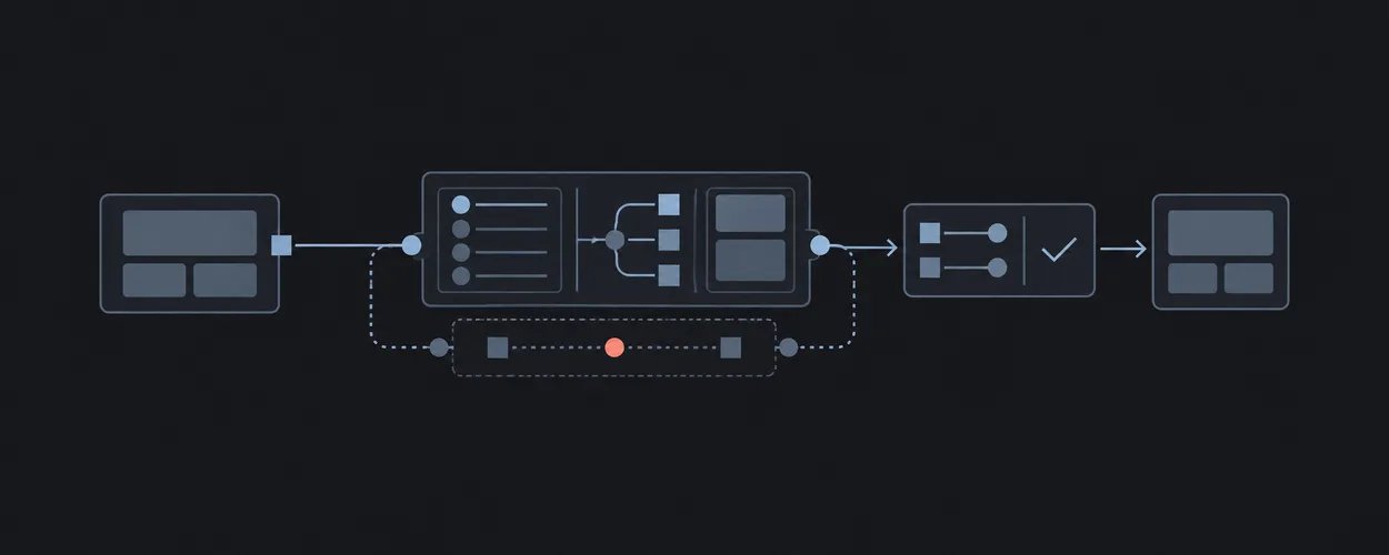
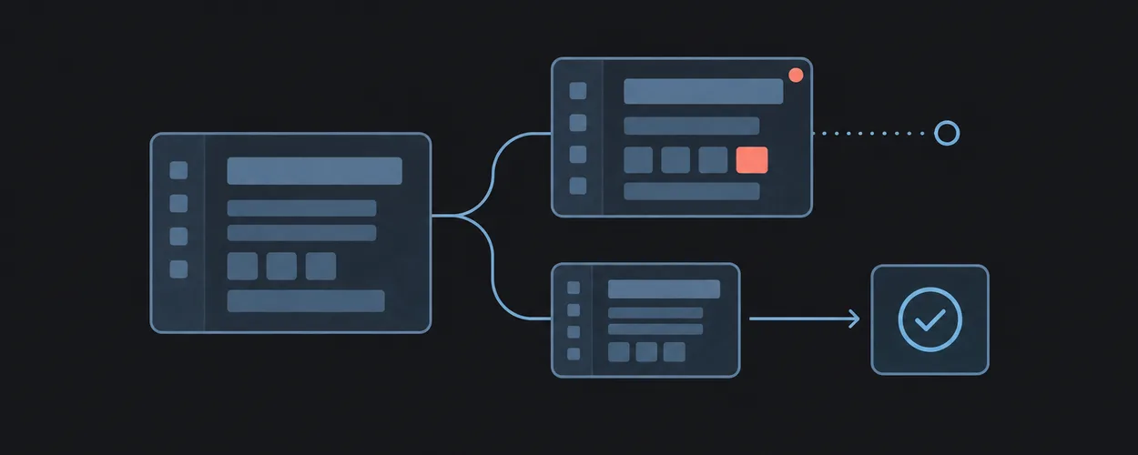
Dialog와 Popover의 동작 정하기
Native Interaction Contracts
컴포넌트 선택부터 키보드, 포커스 복귀, 닫기 동작까지 연결합니다.
이 자료로 구현하기
원문 주소와 버전이 포함된 요청문입니다. 복사한 뒤 만들 화면과 요구사항을 채워 에이전트에게 전달하세요.
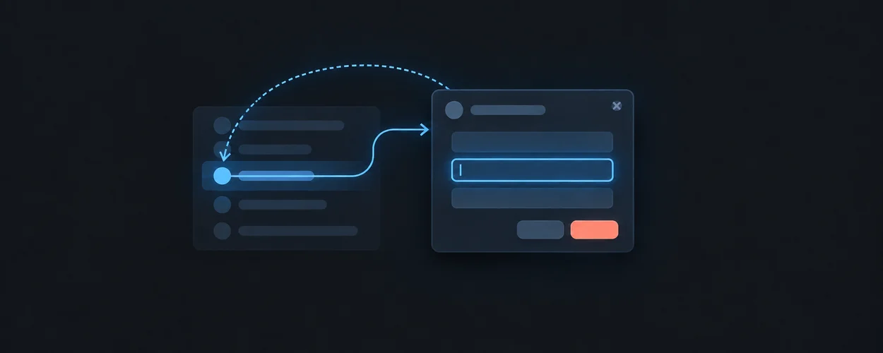
FROM PRINCIPLE TO PRACTICE
이 원리로 만든 예제 48
예제를 열어 동작을 살펴보고, 코드와 함께 이 문서의 원리를 확인해 보세요.
File Tree
- 파일 모양과 실제 위젯 모델
File Tree는 중첩 Radix Accordion으로 폴더를 열고 파일 button을 선택합니다. 기본 정렬은 폴더 우선·영어 숫자 비교이며 초기 button ID의 상위 경로를 펼칩니다. tree 역할과 그에 따른 전체 키보드 탐색을 구현했다고 이름만으로 추정해서는 안 됩니다.
- 파일 모양과 실제 위젯 모델
Hero Video Dialog
- 영상 오버레이의 모달 계약
HeroVideoDialog는 button으로 열지만 열린 표면은 role=button인 motion.div입니다. 바깥 클릭과 그 요소의 키 입력으로 닫으며 닫기 아이콘 버튼의 별도 이름·초점 이동·트랩·복귀는 선언되지 않습니다. iframe 플레이어가 이 계약을 대신하지 않습니다.
- 영상 오버레이의 모달 계약
Rainbow Button
- asChild가 바꾸는 제어의 의미
RainbowButton은 기본 button 대신 asChild일 때 Radix Slot에 클래스를 넘깁니다. 기본 스타일에는 disabled 포인터 차단과 focus-visible이 있지만 링크 자식의 비활성 행동까지 정하지는 않습니다. 데모는 기본 버튼·문구만 제공합니다.
- asChild가 바꾸는 제어의 의미
연결된 예제 45개 더 보기
Building Async Page Transitions in Vanilla JavaScript
- 주소 변경과 비동기 화면 교체의 실패 경로
Router.navigate는 먼저 pushState한 뒤 performTransition을 기다립니다. performTransition은 이전 페이지 cleanup 후 모듈을 로드하고 finally에서 입력 잠금을 풀며, 초기 클릭 처리는 내부 링크의 기본 동작을 일괄 막습니다.
- 주소 변경과 비동기 화면 교체의 실패 경로
Creating Scroll-Driven SVG Map Animations with GSAP
- 지도 확대가 바꾸는 페이지 스크롤 책임
expand-map은 body overflow를 hidden으로 바꾸고 지도 폭과 경로 진행을 끝까지 늘립니다. 닫기는 폭을 50%로 돌리고 overflow=scroll을 쓰며 resize도 스크롤을 다시 켭니다.
- 지도 확대가 바꾸는 페이지 스크롤 책임
Dynamic Tooltip Reveal Animations
- 포인터 툴팁의 경계 보정과 노출 계약
calculateTooltipPosition은 client 좌표에 문서 스크롤을 더하고 오른쪽·아래가 넘치면 반대편에 둡니다. 계산 자체는 키보드 초점의 앵커나 툴팁 관계를 제공하지 않습니다.
- 포인터 툴팁의 경계 보정과 노출 계약
Expanding Rounded Menu Animation
- 둥근 메뉴의 재생 잠금과 닫기 경로
expandMenu와 collapseMenu는 isAnimating 동안 입력을 거절합니다. 메뉴 클래스는 타임라인 콜백에서 바뀌고 공개 이벤트 연결은 링크 클릭과 back 클릭입니다.
- 둥근 메뉴의 재생 잠금과 닫기 경로
Name the thing it does.
- 09 / Semantic preparation inspector · renderSemanticTree
An independent preparation inspector maps stable node identities to native HTML elements and named layout constraints. Node selection, role editing and a shared spacing variable update the rendered fixture and its generated markup together. It studies semantic preparation, not a provider import. This binding describes the authored study and does not verify the original project.
- 09 / Semantic preparation inspector · renderSemanticTree
From SplitText to MorphSVG: 5 Creative Demos Using Free GSAP Plugins
- 재생 아이콘의 모양 상태와 실제 기능 구분
Morphing Play/Pause는 클릭마다 로컬 isPlaying을 뒤집어 path를 바꿉니다. 이 함수에는 실제 미디어 재생 연결이 없고 별도 문서 클릭 핸들러가 15~30개 confetti를 만들며 완료 때 제거합니다.
- 재생 아이콘의 모양 상태와 실제 기능 구분
Good things have roots.
- 10 / Clipping, states & responsive callouts · renderPlant
A native range and pointer position share a clipping value for an original SVG pot cross-section. Stable feature selection drives reusable callouts. The care button has idle, hover/focus and expanded states, while its semantic expansion state commits immediately. This binding describes the authored study and does not verify the original project.
- 10 / Clipping, states & responsive callouts · renderPlant
Image Layer Animations with Clip-Path
- 화면 전체 클릭으로 바뀌는 콘텐츠
첫 변형은 document 클릭을 전환 트리거로 삼되 frame 안과 재생 중 입력을 제외합니다. 중간에 hidden 클래스를 바꾸고 마지막 이미지 레이어가 벗겨집니다.
- 화면 전체 클릭으로 바뀌는 콘텐츠
Stack to Content Layout Transition
- 스크롤을 상세 닫기 입력으로 사용하는 표면
Slideshow는 상세가 열려 있고 애니메이션 중이 아닐 때 scrollFn에서 close를 호출하고 observer를 비활성화합니다. 닫기 버튼·이전·다음도 별도로 등록합니다.
- 스크롤을 상세 닫기 입력으로 사용하는 표면
SVG Overlay and Infinite Menu Background Animation
- 덮개가 가리는 순간에 메뉴 상태 교체
openMenu는 SVG 곡선을 화면 전체로 확장한 뒤 onComplete에서 메뉴와 frame의 열림 클래스를 추가합니다. 이어 덮개가 반대쪽으로 벗겨집니다.
- 덮개가 가리는 순간에 메뉴 상태 교체
흐린 배경 위 선택형 구독 창
- 흐린 배경 위 선택형 구독 창의 구현 계약
showModal의 모달·초점 책임과 폼의 유효성 확인을 분리하고 닫으면 호출 버튼으로 초점을 돌립니다. 이 연결은 새로 작성한 실행 코드의 계약을 설명하며, 원본의 동작을 검증했다는 뜻은 아닙니다.
- 흐린 배경 위 선택형 구독 창의 구현 계약
제품과 폼이 나뉜 구독 대화상자
- 제품과 폼이 나뉜 구독 대화상자의 구현 계약
모달의 입력·닫기 책임을 유지하면서 장식 제품 패널만 좁은 화면에서 제거하여 핵심 폼의 공간을 확보합니다. 이 연결은 새로 작성한 실행 코드의 계약을 설명하며, 원본의 동작을 검증했다는 뜻은 아닙니다.
- 제품과 폼이 나뉜 구독 대화상자의 구현 계약
언어와 메뉴가 묶인 탐색 캡슐
- 언어와 메뉴가 묶인 탐색 캡슐의 구현 계약
일반 탐색 disclosure와 언어 선택을 다른 상태로 유지하며 aria 메뉴 역할을 외형 때문에 추가하지 않습니다. 이 연결은 새로 작성한 실행 코드의 계약을 설명하며, 원본의 동작을 검증했다는 뜻은 아닙니다.
- 언어와 메뉴가 묶인 탐색 캡슐의 구현 계약
이미지 동의창의 세 가지 경로
- 이미지 동의창의 세 가지 경로의 구현 계약
수락·거절·설정 공개를 각각 동작시키되 이 예제의 상태 선택을 실제 쿠키 저장이나 동의 처리로 주장하지 않습니다. 이 연결은 새로 작성한 실행 코드의 계약을 설명하며, 원본의 동작을 검증했다는 뜻은 아닙니다.
- 이미지 동의창의 세 가지 경로의 구현 계약
동일 목적지를 잇는 지도와 목록
- 동일 목적지를 잇는 지도와 목록의 구현 계약
자체 지도와 일반 링크 목록이 같은 네 disclosure 목적지를 가리킵니다. 퀘스트·인물 이동·수집·점수·1인칭 조작을 포함하지 않습니다. 이 연결은 새로 작성한 실행 코드의 계약을 설명하며, 원본의 동작을 검증했다는 뜻은 아닙니다.
- 동일 목적지를 잇는 지도와 목록의 구현 계약
다섯 재료 카드와 상세창
- 다섯 재료 카드와 상세창의 구현 계약
다섯 범주의 자체 물건 그림과 대상 이름이 있는 더하기 버튼을 제공합니다. 하나의 네이티브 상세창은 선택한 설명을 열고 닫을 때 호출 버튼으로 초점을 돌려줍니다. 원본 AR 기능은 구현하지 않습니다. 이 연결은 새로 작성한 실행 코드의 계약을 설명하며, 원본의 동작을 검증했다는 뜻은 아닙니다.
- 다섯 재료 카드와 상세창의 구현 계약
문장 속 더하기로 펼치는 소개
- 문장 속 더하기로 펼치는 소개의 구현 계약
새 소개 문장의 밑줄은 강조로만 사용하고 원형 더하기 버튼이 관계가 명시된 설명을 펼칩니다. 확장 상태와 밝기 상태는 독립적이며 원본 결과를 추정하지 않습니다. 이 연결은 새로 작성한 실행 코드의 계약을 설명하며, 원본의 동작을 검증했다는 뜻은 아닙니다.
- 문장 속 더하기로 펼치는 소개의 구현 계약
욕실 그림과 입력을 반씩 나눈 구독창
- 욕실 그림과 입력을 반씩 나눈 구독창의 구현 계약
네이티브 dialog가 모달·취소를 소유하고 입력 초안은 닫았다 열어도 보존됩니다. 사진 자리가 작아져도 이메일·검증 결과·닫기는 그대로 남습니다. 이 연결은 새로 작성한 실행 코드의 계약을 설명하며, 원본의 동작을 검증했다는 뜻은 아닙니다.
- 욕실 그림과 입력을 반씩 나눈 구독창의 구현 계약
Card Accordion · Myna UI
- 질문 버튼과 답변 영역의 관계
질문 문자열은 AccordionTrigger의 자식이고 primitive는 Header 안에 Trigger를 놓습니다. 마지막 항목만 아래 테두리를 제거하며 답변은 본문입니다. 예제의 마이크로 인터랙션 설명은 원래 고정 문구이며 이 구현의 품질 근거가 아닙니다.
- 질문 버튼과 답변 영역의 관계
Destructive Alert Dialog · Myna UI
- 취소와 파괴적 확인의 초점 경로
제목과 설명은 AlertDialogTitle·Description이며 Cancel과 Continue가 footer에 있습니다. primitive가 Portal·Overlay·Content를 만들고 소스는 초기 초점이나 복귀를 덮어쓰지 않습니다.
- 취소와 파괴적 확인의 초점 경로
Error Alert Dialog · Myna UI
- 취소 버튼이 없는 단일 확인 창
폭은 max-w-[360px]이고 footer에는 Okay 한 개만 있습니다. AlertDialogCancel과 별도 X 버튼을 렌더링하지 않으므로 다른 확인 예제의 초기 초점이나 닫기 버튼을 그대로 가정할 수 없습니다.
- 취소 버튼이 없는 단일 확인 창
Centered Alert Dialog · Myna UI
- 중앙 문구와 버튼의 시각적 순서
footer에 sm:justify-between이 추가되지만 primitive의 작은 화면 flex-col-reverse는 유지됩니다. DOM에서는 Cancel이 먼저이고 Continue가 다음입니다. 아이콘은 aria-hidden으로 제목을 대신하지 않습니다.
- 중앙 문구와 버튼의 시각적 순서
Success Alert Dialog · Myna UI
- 하나의 Okay로 닫는 정보 창
max-w-[360px] 창에 Title·Description과 Okay Action 하나를 둡니다. Cancel이나 별도 X는 없고 Close를 추가하는 일반 Dialog primitive도 사용하지 않습니다. 반복 열기와 Escape의 초점 경로는 실행 검토 대상으로 남습니다.
- 하나의 Okay로 닫는 정보 창
Split Button · Myna UI
- 화살표가 메뉴 구현을 대신하지 않는다
SplitButton은 Button 두 개와 ChevronDown만 사용합니다. DropdownMenu, 열림 state, onClick, 항목이 없으므로 화살표를 눌러 선택지를 펼치는 구현은 없습니다. Send Now도 실제 발송과 연결되지 않습니다.
- 화살표가 메뉴 구현을 대신하지 않는다
Simple Command List · Myna UI
- 검색 입력과 명령 후보 탐색
파일 4개·편집 5개·이동 4개 항목을 cmdk 기반 Command에 넣고 CommandInput과 CommandEmpty를 제공합니다. 데모는 별도 filter를 지정하지 않아 검색·활성 후보 처리를 cmdk에 맡깁니다. CommandDialog가 아닌 상시 목록입니다.
- 검색 입력과 명령 후보 탐색
Profile Context Menu · Myna UI
- 우클릭 영역의 키보드 호출
원본 ContextMenuTrigger는 PJ와 Right Click Here를 담고 있지만 asChild button이나 tabIndex를 지정하지 않습니다. 로컬 primitive는 Radix Trigger를 그대로 노출합니다. 실제 Tab 진입·컨텍스트 메뉴 키 호출을 가능하다고 미리 단정하지 않습니다.
- 우클릭 영역의 키보드 호출
Content Dialog · Myna UI
- 일반 문단과 대화상자 설명 관계
본문은 DialogDescription이 아닌 p입니다. imported DialogContent는 Portal과 기본 Close 버튼을 추가하고 제목은 DialogTitle에 연결됩니다. p가 자동으로 대화상자 설명에 연결된다고 가정하지 않습니다.
- 일반 문단과 대화상자 설명 관계
Add Task Dialog · Myna UI
- 중첩 선택 팝업과 레이블 대상
Task Name은 Label htmlFor="name"과 Input id="name"을 연결합니다. Assignee의 id는 SelectTrigger가 아닌 SelectValue에 놓입니다. SelectContent는 별도 Portal을 사용하므로 선택 팝업을 닫는 Escape와 Dialog를 닫는 Escape의 소유권도 확인해야 합니다.
- 중첩 선택 팝업과 레이블 대상
Content Drawer · Myna UI
- 아래쪽 표면의 닫기 경로
DrawerContent는 Portal 안에 bottom-0인 고정 표면을 만들고 위쪽 손잡이 모양을 추가합니다. 원본은 Cancel을 DrawerClose로 감싸 드래그 없이 닫을 선택지를 제공합니다. 실제 제스처 동작과 초점은 Vaul에 맡깁니다.
- 아래쪽 표면의 닫기 경로
Login Drawer · Myna UI
- 화면 키보드와 하단 필드의 가시성
폼의 Label은 email·password ID를 가리키고 autocomplete은 username·current-password입니다. DrawerContent는 bottom-0·h-auto이며 이 데모는 자체 최대 높이·스크롤 영역을 선언하지 않습니다. 작은 높이나 화면 키보드에서 필드와 Cancel에 닿는지는 실행 확인 대상입니다.
- 화면 키보드와 하단 필드의 가시성
Help Dropdown · Myna UI
- 도움말 메뉴와 목적지 링크
Getting Started·Contact Us·Blog·Security·Changelog는 DropdownMenuItem이며 링크나 onSelect가 없습니다. imported Content가 Portal과 사용 가능한 높이의 세로 스크롤을 제공하지만 목적지 페이지를 만들지는 않습니다.
- 도움말 메뉴와 목적지 링크
Profile Dropdown · Myna UI
- 하위 메뉴와 바깥 메뉴의 초점
Visibility는 SubTrigger이며 SubContent를 DropdownMenuPortal에 넣습니다. 안의 Online·Appear Offline에는 실행 콜백이 없습니다. Personal Settings의 ⌘S도 span인 Shortcut 표시일 뿐 전역 키 등록은 아닙니다.
- 하위 메뉴와 바깥 메뉴의 초점
Folder Dropdown · Myna UI
- 목록 탐색과 단축키 표시는 별개
N·S·M·D·R은 DropdownMenuShortcut 자식이고 primitive는 span으로 출력합니다. 별도 키 리스너는 없습니다. 이름이 있는 트리거 Button은 w-56이며 열린 목록도 같은 폭을 요청합니다.
- 목록 탐색과 단축키 표시는 별개
Calendar Form · Ved UI
- 달력 팝업의 진입과 닫힘
작성자 PopoverContent는 Radix Portal에 렌더링되고 CalendarForm은 initialFocus를 넘깁니다. onSelect는 field.onChange에 직접 연결되어 있으며 선택 즉시 팝업을 닫는 명령은 없습니다. 팝업의 기본 동작은 래퍼 이름만으로 보장하지 않고 열기·날짜 선택·Escape를 따로 확인해야 합니다.
- 달력 팝업의 진입과 닫힘
MultiSelect Form · Ved UI
- 검색 입력과 선택 목록의 별도 책임
예제는 고정 characters 옵션만 전달하며 원격 검색 콜백은 사용하지 않습니다. 작성자 컴포넌트는 선택된 value를 후보에서 제외하고 option.disable을 CommandItem에 넘깁니다. Jerry는 선택 불가로 지정되고 Clear all은 숨깁니다. Escape는 입력을 blur하며, 빈 입력의 Backspace/Delete는 마지막 선택을 제거하는 별도 동작입니다.
- 검색 입력과 선택 목록의 별도 책임
Select Form · Ved UI
- 세 이메일 중 하나를 고르는 팝업
원본은 세 개의 이메일 문자열을 SelectItem의 값과 텍스트로 유지합니다. 작성자 래퍼는 Radix Trigger와 Item을 사용하고 Content를 Portal에 넣으며 위·아래 스크롤 버튼을 포함합니다. 트리거의 자식 span에는 line-clamp-1을 적용하므로 좁은 폭에서 긴 이메일을 어떻게 확인하는지도 검증 대상입니다.
- 세 이메일 중 하나를 고르는 팝업
Icon Menubar · Myna UI
- 세 메뉴 사이의 키보드 이동
Dashboard·Bookmarks·Collections가 각각 MenubarMenu이며 각 메뉴에 항목 3개가 있습니다. MenubarPrimitive.Root·Trigger에 동작을 맡기고 데모가 별도 키 핸들러를 정의하지 않습니다.
- 세 메뉴 사이의 키보드 이동
Text Popover · Myna UI
- 관련 정보 공개와 명령 메뉴의 차이
이 팝오버는 h4 제목과 p 설명만 제공합니다. 메뉴 항목·form·저장 상태가 없으며 PopoverTrigger asChild가 Open Popover 버튼을 연결합니다. 목록 명령이나 모달 편집기를 제공하는 예제가 아닙니다.
- 관련 정보 공개와 명령 메뉴의 차이
User Popover · Myna UI
- 카드 안 버튼의 초점과 실행 경계
View Profile과 Message는 flex-1인 Button 두 개이며 href·onClick이 없습니다. 트리거는 asChild 없이 PopoverTrigger 자체를 쓰고 안에 이름과 아바타를 넣습니다. 버튼 활성화가 프로필 이동이나 메시지 발송을 뜻하지 않습니다.
- 카드 안 버튼의 초점과 실행 경계
Add Book Popover · Myna UI
- 이름 없는 열기 버튼과 편집 중 닫힘
Plus만 있는 트리거 Button에는 aria-label·숨긴 텍스트가 없습니다. 내부 Title·Author 레이블은 각 input ID를 가리키지만 초안 저장 상태는 없습니다. 바깥 클릭이나 Escape로 닫을 때 작성 값을 보존하는 계약도 선언하지 않습니다.
- 이름 없는 열기 버튼과 편집 중 닫힘
업데이트 안내 · Origin UI
- Later는 링크 스타일의 버튼
Install은 기본 Button이고 Later는 variant=link Button입니다. 둘 다 asChild를 지정하지 않으므로 작성자 래퍼의 기본 button으로 렌더링됩니다. Later에 href는 없고 세 버튼 모두 클릭 처리기가 없어 설치·보류·닫기 상태를 변경하지 않습니다.
- Later는 링크 스타일의 버튼
Fieldwork · A workspace that remembers
- Fieldwork · A workspace that remembers · renderNavigation
The shell stores selected view, group disclosure and sidebar visibility independently. Hiding navigation releases its space while the breadcrumb and content continue to read the same selection. This binding describes the authored study; it is not verification of the original.
- Fieldwork · A workspace that remembers · renderNavigation
Floating dock떠 있는 도크
- 도크 모양과 버튼 동작의 구분
다섯 아이콘은 기본 버튼이며 클릭하면 아래 선택 문구만 바뀝니다. 포인터에서는 가까운 이웃 버튼도 커지지만 키보드 초점은 선택한 버튼 자체를 강조합니다. 앱 실행이나 페이지 이동은 구현되어 있지 않습니다.
- 도크 모양과 버튼 동작의 구분
Accordion열리는 작은 목록
- 여러 질문을 여는 기본 디스클로저
각 질문은 독립된 details·summary이며 첫 질문만 처음부터 열려 있습니다. 하나를 열 때 다른 질문을 닫는 코드는 없으므로 여러 답을 함께 볼 수 있습니다. 장식용 더하기 표시는 열림 상태에 따라 회전합니다.
- 여러 질문을 여는 기본 디스클로저
Expanding menu움직이는 메뉴
- 메뉴 모양의 펼침 버튼 그룹
상단 버튼은 펼침 상태와 내용의 hidden 속성을 함께 바꿉니다. 내부 항목은 기본 버튼이고 선택 시 아래 문구만 갱신합니다. 메뉴 역할·방향키 이동·자동 닫힘은 없으며 항목은 같은 등장 시간으로 재생됩니다.
- 메뉴 모양의 펼침 버튼 그룹
Primary role: product component selection and behavior guide.
Repository Boundary
This guide extends the Component Contract with source-backed decisions for native HTML and custom composites. It owns product behavior, not reusable Layout CSS. The shared accessibility evidence contract remains the authority for evidence claims.
Reusable Method
Write the user's task, the information being exposed, whether background interaction remains available, and what closes the surface. Choose semantics before appearance. Then assign keyboard, focus, pointer, and state ownership. A floating rectangle is insufficient information to choose a component.
Mechanisms And Obligations
| Source | Bounded finding | Consumer responsibility |
|---|---|---|
| HTML interactive elements | details is a disclosure; dialog supports distinct modal and nonmodal presentation. showModal() participates in the modal/inert model. |
Choose the right behavior, accessible name, initial focus, and close policy. |
| HTML popover | The attribute adds presentation behavior to elements with their own semantics; custom menu keyboard behavior still needs implementation. | Select a semantic element or role and implement its interaction contract. |
| APG modal dialog | The pattern describes contained keyboard navigation, focus placement, and return. Initial focus depends on content and task. | Test focus with long content and a missing invocation control. |
| APG menu button | A menu button opens a menu of actions or functions with the menu keyboard model. | Do not assign menu roles solely because links appear in a dropdown. |
| APG combobox | A combobox has a value and a popup with defined keyboard/state relationships. | Specify text editing, suggestion navigation, selection, and escape separately. |
| APG disclosure | The disclosure control exposes expanded/collapsed state and toggles associated content. | Keep the control name, state, and controlled content consistent. |
| WAI-ARIA 1.2 | aria-disabled communicates disabled semantics. It does not implement event suppression. |
Prevent disallowed activation in the application's actual event paths. |
HTML is a Living Standard; WAI-ARIA 1.2 is a Recommendation; APG is informative implementation guidance. Sources were inspected 2026-09-21. Pattern examples do not establish support for an unspecified browser and assistive-technology combination.
Selection Questions
| User need | Starting point | Question that can change the choice |
|---|---|---|
| Reveal optional explanatory content | Native disclosure | Does this actually switch mutually exclusive views or choose a value? |
| Complete a bounded task while background interaction is unavailable | Modal dialog | Must the user compare or interact with the background during this task? |
| Temporarily expose nonmodal related content | Semantically appropriate element with popover behavior | Is the content a menu, a list of links, a form, or plain information? |
| Invoke commands from a compact control | Menu button and menu behavior | Are these ordinary navigation links better served by ordinary link navigation? |
| Edit a value with selectable suggestions | Combobox | Is an ordinary input, select, or separate search-result list sufficient? |
These are local selection heuristics. Similar visuals can correctly produce different DOM, focus, and keyboard behavior.
Worked Contract: Edit A Record
The user opens an editor from a list row. The consumer chooses a modal because this task intentionally suspends interaction with the list. Save commits a submitted snapshot; Close requests dismissal; an unsaved-change decision belongs to the state owner.
| Stage | Decision to record | Adversarial case |
|---|---|---|
| Open | Accessible name and initial focus target | Long introduction would be scrolled out of view by focusing the first input. |
| Edit | Draft lifetime and field-error relationship | Background data refresh replaces the edited row. |
| Save | Request identity and pending activation rule | Enter and a pointer click arrive before the request settles. |
| Dismiss | Which paths request close and which discard changes | Escape, an outside interaction, and an explicit Cancel have different intended meanings. |
| Return | Valid focus destination after closing | The original row was deleted or filtered out. |
Compose submitted snapshot, single flight, and unsaved navigation as needed. Animation completion cannot authorize a write or decide whether a draft is disposable.
Preserve Editing Inside Composites
An editable combobox has at least two responsibilities: editing text and navigating candidate options. Specify when Arrow keys move a candidate, when Enter accepts it, and when Escape dismisses suggestions while retaining the typed text. During IME composition, those keys may belong to the input method; follow Text Input And Internationalization.
A disabled-looking control needs a deliberate discoverability policy. Native disabled and aria-disabled have different behavior; choose which focus and activation behavior the task requires, and explain why an action is unavailable without relying only on color.
Opinionated Guidance
Prefer native semantics when they fit the task, and build the smallest custom behavior that remains necessary. Name the semantic reason for every role override. Treat multiple open surfaces as an ownership question: which surface receives Escape, where focus stays, and which state survives dismissal.
Platform-Specific Guidance
Native HTML behavior, browser support, and accessibility mappings are separate from framework component names. Record the browser, framework adapter, and assistive technology used in verification. A native platform's “popover” does not settle the web contract; compare Interaction Semantics and Platform Adaptation.
Unsupported Absolutes
Top-layer presentation does not imply modality. A role does not supply keyboard handlers. Native HTML does not remove the need for an accessible name or target verification. Escape does not intrinsically mean “discard all work.”
Verification Contract
The proposed matrix includes keyboard-only opening and closing, forward/backward Tab, active popup navigation, IME input, a removed opener, nested surface dismissal, long content, zoom, and reduced motion. Check visible behavior, DOM state, accessibility semantics, and the actual announcement path separately.
Record the selected widget model and expected key behavior before testing. Passing a self-written handler test establishes that handler's behavior, not conformance with APG or the platform. Compare observed behavior with the cited contract. No browser or screen-reader execution is claimed by this guide. Re-review when the widget model, browser, or focus owner changes.
Source, License, And Attribution
Locally authored synthesis of the official sources linked above, inspected 2026-09-21. No upstream examples or implementation are reproduced. consumer_reference: not_applicable because this guide selects no consumer component record.
IA Navigation
Parent: Design Engineering. Next: Text Input And Internationalization.