Layout
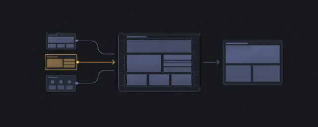
정렬, 그리드, 반응형 배치와 스크롤을 위한 작은 HTML·CSS 패턴.
이 자료로 구현하기
원문 주소와 버전이 포함된 요청문입니다. 복사한 뒤 만들 화면과 요구사항을 채워 에이전트에게 전달하세요.
FROM PRINCIPLE TO PRACTICE
이 원리로 만든 예제 9
예제를 열어 직접 조작하고, 관찰한 동작을 이 문서의 원리와 비교해 보세요.
Android
- 기기 외곽과 화면의 좌표 계약
Android는 고정 좌표의 SVG 외곽과 360×800 클립을 사용하지만 viewBox는 width·height 입력에서 만듭니다. 대표 데모에는 화면 이미지가 없으므로 기기 프레임만 보여 줍니다. 크기 입력 변경과 CSS 확대를 같은 동작으로 가정할 수 없습니다.
- 기기 외곽과 화면의 좌표 계약
Dot Pattern
- 창 크기와 부모 크기 변화의 차이
DotPattern은 측정 크기를 간격으로 나누어 circle을 생성합니다. 최초와 window resize 때만 재측정합니다. 대표 데모는 glow를 켜지 않은 정적 점 배경이며, 사이드바처럼 창 크기 없이 부모만 변하는 경우는 별도 점검 대상입니다.
- 창 크기와 부모 크기 변화의 차이
Grid Pattern
- 장식 격자와 실제 콘텐츠 배치
GridPattern은 SVG pattern과 선택된 칸의 rect를 그리는 배경이며 CSS Grid로 자식을 배치하지 않습니다. 데모의 squares에는 중복 좌표가 있어 좌표 기반 key가 반복됩니다. 마스크와 기울기도 제품 표현입니다.
- 장식 격자와 실제 콘텐츠 배치
연결된 예제 6개 더 보기
iPhone
- 비율 프레임과 화면 미디어의 동기
Iphone은 433/882 비율을 유지하고 화면 위치·크기를 백분율로 계산해 SVG 프레임 아래 미디어를 둡니다. videoSrc가 src보다 우선합니다. 대표 데모는 434px 부모에 미디어 없는 프레임만 둡니다.
- 비율 프레임과 화면 미디어의 동기
Meteors
- 별똥별 시작점의 공간 기준
Meteors는 window.innerWidth를 기준으로 임의 left를 만들지만 span은 가장 가까운 위치 지정 부모에 놓입니다. 데모는 높이 500px의 잘리는 영역에 30개를 둡니다. 창 크기가 변해도 같은 props라면 시작점 배열을 다시 만들지 않습니다.
- 별똥별 시작점의 공간 기준
Progressive Blur
- 흐림 아래 끝 항목의 읽기
ProgressiveBlur는 여덟 backdrop-filter 레이어를 마스크로 겹칩니다. 데모는 400px ScrollArea 아래 40%에 효과를 놓고 20개 번호 행을 스크롤합니다. 마지막 행을 읽는 책임은 효과가 아니라 스크롤 구성에 남습니다.
- 흐림 아래 끝 항목의 읽기
Scroll Progress
- 진행 막대가 읽는 스크롤 소유자
ScrollProgress의 useScroll에는 container나 target이 없어 문서 진행률을 scaleX에 연결합니다. 대표 데모는 막대를 페이지 상단에서 65px 아래에 고정합니다. 예제 내부의 별도 스크롤 패널 진행률은 표시하지 않습니다.
- 진행 막대가 읽는 스크롤 소유자
Warp Background
- 원근 배경과 카드 공간의 분리
WarpBackground는 container 단위를 사용하는 네 원근 평면에 빔을 반복하고 children은 별도 relative 영역에 둡니다. 데모는 p-20 바깥 여백 안의 w-80 카드라 좁은 부모에서 필요한 폭이 커집니다. 기본 빔은 면마다 세 개입니다.
- 원근 배경과 카드 공간의 분리
Feature mosaic제품의 작은 순간들
- 고정 모자이크의 내용과 부모 폭
왼쪽 칸이 두 행을 차지하는 2열 모자이크이며 전체 높이는 200픽셀입니다. 자동으로 열 수를 줄이는 반복 그리드는 아닙니다. 회전 기호와 수치·막대는 제품 장식으로 두고 배치 안정성과 따로 봅니다.
- 고정 모자이크의 내용과 부모 폭
The Layout domain owns minimal, portable CSS layout patterns and their planning, composition, constraint, scroll-ownership, and verification contracts. Its canonical content remains at the existing repository paths.
Scope Boundary
In scope: semantic spatial structure, flow, sizing, alignment, containment, scrolling, ratios, and layout composition.
Out of scope: product motion, brand, typography, color, shadow, decorative treatment, and platform imitation.
Routes
- Start with the Layout Planning Guide when the spatial problem is not yet clear.
- Use the Layout Decision Tree when the pattern name is unknown.
- Browse the Layout Pattern Catalog when the problem or name is known.
- Compose full screens with Layout Recipes.
- Review claims through Quality Gates.
Layout Domain Principles
- Layout problems only
- Patterns exist to solve spatial problems, not to define a visual brand.
- Core CSS should stay focused on layout responsibilities.
- Semantic structure first
- Start with meaningful HTML before adding layout classes.
- Class names explain layout responsibility, but they do not replace landmarks, headings, lists, buttons, links, or form controls.
- DOM order, reading order, and focus order should remain logical.
- One primary spatial problem
- Each pattern should optimize one primary spatial problem.
- Secondary behavior is allowed when it is incidental or required for composition.
- If a pattern has multiple primary problems, split it into smaller primitives or mark it as a shell/composite.
- Minimum robust CSS
- Use the smallest set of declarations that keeps the pattern stable under real content and container constraints.
- Minimal does not mean fragile; constraints, overflow rules, intrinsic sizing, and fallbacks are valid when they carry declared responsibility.
- Portable plain HTML/CSS
- Plain HTML and CSS are the source of truth.
- Framework-specific versions are optional derivatives, not canonical patterns.
- Explicit constraints and change points
- Widths, heights, gaps, breakpoints, scroll containers, fixed/sticky anchors, and other constraints should be easy to find.
- Values users are expected to tune should be surfaced clearly.
- Named scroll ownership
- If a pattern scrolls, the scrolling element must be obvious.
- The pattern should make clear what scrolls, what stays fixed, and where height is determined.
- No decorative debt
- Decorative styling does not belong in reusable pattern CSS unless it is required to explain layout behavior.
- Demo-only visual aids should be separate from the reusable pattern.
CSS Authoring Policy
- Prefer low-specificity, single-class selectors.
- Avoid ID selectors for styling or layout naming.
- Avoid deep combinators, selector chaining, and nesting unless the pattern is specifically demonstrating that tradeoff.
- Use cascade layers when the CSS surface grows beyond isolated snippets.
- Keep CSS declarations in alphabetical order inside each rule.
- Prefer intrinsic sizing and content/container-driven adaptation.
- Use viewport breakpoints only when the spatial problem is viewport-level.
- Prefer container queries for component-local responsiveness.
- Prefer logical properties for spacing and sizing unless physical direction is required.
- Treat exceptions as explicit and local; use state hooks or
data-*attributes for variants instead of escalating selector specificity.
Class Naming Policy
Class names should read like a map of the layout structure.
- Name layout responsibility, not appearance.
- Make root-child, parent-child, area-element, and fixed-scroll relationships obvious.
- Prefer pattern-scoped names for related nodes.
- Avoid vague names like
container,wrapper,box,top,content, andbottomunless the surrounding pattern name makes their responsibility unambiguous. - Avoid DOM-depth names such as
card_header_title_icon; describe stable roles instead. - Do not use IDs for layout naming. IDs are reserved for JavaScript hooks or document-level targets when needed.
Prefer:
<div class="app_shell">
    <header class="app_shell_header"></header>
    <main class="app_shell_scroll_area"></main>
    <footer class="app_shell_footer"></footer>
</div>
Avoid:
<div class="container">
    <div class="top"></div>
    <div class="content"></div>
    <div class="bottom"></div>
</div>
Value And Token Policy
- Tokenize reusable design intent, not every layout number.
- Use tokens for stable, shared values such as
content-width,gutter,stack-gap,section-gap, or density steps. - Keep browser/context mechanics in raw CSS:
auto, percentages,min-content,max-content,fit-content,clamp(), viewport units, container-query units, and intrinsic sizing. - Put tokens behind logical CSS, for example
padding-block: var(--space-4). - Use breakpoint names for layout states, not device names.
Pattern Contract
Use this shape when adding a new pattern:
Pattern name
Category
Primary spatial problem
Secondary spatial problems
When to use
HTML structure
CSS
Core properties
Properties that break the layout if removed
Constraints and change points
Scroll ownership
Accessibility and source-order notes
Browser/fallback notes
Composition notes
Anti-patterns
The generated Pattern Categories index is the category inventory.
Verification Matrix
Before accepting a pattern, verify the smallest relevant matrix:
- Viewports:
320px,375px,768px,1024px,1440px - Containers: tight, medium, roomy, and
100%parent - Content: empty, short, long label, long paragraph, unbroken string
- Direction:
ltrandrtl - Writing mode: default, plus vertical writing mode if the pattern claims support
- Interaction: default, hover, focus, active, expanded, scroll top/middle/bottom when relevant
Acceptance checks:
- The layout reflows without unusable two-dimensional scrolling.
- Long and empty content do not break alignment or hide essential content.
- Focus order remains logical and visible.
- Scrollable regions and sticky elements behave as declared.
- Screenshot diffs are reviewed when the pattern has visual fixtures.
Stable Path Contract
GUIDE.md, guides/*.md, recipes/*.md, patterns/**/*.md, CATALOG.md, and quality/**/*.md remain at their existing paths. This hub is a domain-local route, not a migration or duplicate source of truth.
IA Navigation
Parent: StyleGallery. Next: Motion.