Codrops 원본
Make Way Grid Effect
섹션 · MIT
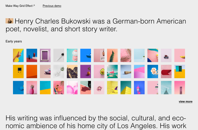
갤러리 안에서는 화면을 벗어나거나 움직임을 멈추면 예제도 닫힙니다. 다시 재생할 때는 처음부터 시작해요.
SOURCE FILES
원본 코드 읽기
수집한 원본 소스와 실행 안내를 함께 제공합니다.
src/css/base.css
*,
*::after,
*::before {
	box-sizing: border-box;
}

:root {
	font-size: 18px;
	--color-text: #000;
	--color-bg: #ededed;
	--color-link: #000;
	--color-link-hover: #000;
}

body {
	margin: 0;
	color: var(--color-text);
	background-color: var(--color-bg);
	font-family: elza, sans-serif;
	-webkit-font-smoothing: antialiased;
	-moz-osx-font-smoothing: grayscale;
	overflow-x: hidden;
}

/* Page Loader */
.js .loading::before,
.js .loading::after {
	content: '';
	position: fixed;
	z-index: 1000;
}

.js .loading::before {
	top: 0;
	left: 0;
	width: 100%;
	height: 100%;
	background: var(--color-bg);
}

.js .loading::after {
	top: 50%;
	left: 50%;
	width: 60px;
	height: 60px;
	margin: -30px 0 0 -30px;
	border-radius: 50%;
	opacity: 0.4;
	background: var(--color-link);
	animation: loaderAnim 0.7s linear infinite alternate forwards;

}

@keyframes loaderAnim {
	to {
		opacity: 1;
		transform: scale3d(0.5,0.5,1);
	}
}

a {
	text-decoration: none;
	color: var(--color-link);
	outline: none;
	white-space: nowrap;
	overflow: hidden;
	position: relative;
}

a:not(.frame__title-back)::before {
	content: '';
	height: 1px;
	width: 100%;
	background: currentColor;
	position: absolute;
	top: 92%;
	transition: transform 0.3s;
	transform-origin: 0% 50%;
}

a:not(.frame__title-back):hover::before {
	transform: scaleX(0);
	transform-origin: 100% 50%;
}

a:hover {
	color: var(--color-link-hover);
	outline: none;
}

/* Better focus styles from https://developer.mozilla.org/en-US/docs/Web/CSS/:focus-visible */
a:focus {
	/* Provide a fallback style for browsers
	 that don't support :focus-visible */
	outline: none;
	background: lightgrey;
}

a:focus:not(:focus-visible) {
	/* Remove the focus indicator on mouse-focus for browsers
	 that do support :focus-visible */
	background: transparent;
}

a:focus-visible {
	/* Draw a very noticeable focus style for
	 keyboard-focus on browsers that do support
	 :focus-visible */
	outline: 2px solid red;
	background: transparent;
}

.unbutton {
	background: none;
	border: 0;
	padding: 0;
	margin: 0;
	font: inherit;
}

.unbutton:focus {
	outline: none;
}

.oh {
	position: relative;
	overflow: hidden;
}

.oh__inner {
	will-change: transform;
    display: inline-block;
}

.frame {
	padding: 1.5rem 2rem;
	display: grid;
	grid-template-columns: 100%;
	grid-template-areas: 'title' 'sponsor';
	align-content: space-between;
}

.frame--footer {
	display: block;
	line-height: 2;
	text-align: center;
}

.frame__title {
	grid-area: title;
	display: flex;
	flex-wrap: wrap;
	justify-content: end;
}

.frame__title-main {
	font-size: 1rem;
	margin: 0;
	font-weight: normal;
}

.frame__title-back {
	position: relative;
	display: flex;
	align-items: flex-end;
	margin-bottom: 0.15rem;
}

.frame__title-back span {
	display: none;
}

.frame__title-back svg {
	fill: var(--color-link);
}

.frame__title-back:hover svg,
.frame__title-back:focus svg {
	fill: var(--color-link-hover);
}

.frame__credits {
	justify-self: end;
}

.content {
	display: flex;
	flex-direction: column;
	justify-content: flex-start;
	padding: 0 2rem;
}

.content__text {
	font-weight: 300;
	line-height: 1.1;
	font-size: clamp(1rem,5vw,2.5rem);
	margin: 2rem 0 0 0;
	max-width: 1350px;
	hyphens: auto;
}

.content__text-img {
	max-height: 1.85rem;
	margin: 0 0.5rem 0 0;
	vertical-align: center;
}

.content__title {
	font-weight: normal;
	margin: 2.5rem 0 0;
}

.content__more {
	align-self: flex-end;
	font-weight: bold;
	cursor: pointer;
	margin-bottom: 2rem;
}

.grid {
	width: 92%;
	margin: 2rem auto;
	display: grid;
	grid-template-columns: repeat(4,1fr);
	grid-gap: 1rem;
	pointer-events: none;
}

.grid__item {
	position: relative;
	margin: 0;
	will-change: transform;
	pointer-events: auto;
}

.grid__item-img {
	width: 100%;
	aspect-ratio: 1/1.25;
	background-size: cover;
	cursor: pointer;
}


@media screen and (min-width: 53em) {
	.frame {
		display: grid;
		grid-template-columns: 20rem 1fr;
		grid-template-rows: auto;
		grid-template-areas: 'title sponsor';
		align-content: space-between;
	}
	.frame__title {
		justify-content: end;
	}
	.frame__title-prev {
		margin-left: auto;
	}
	.frame--footer {
		display: grid;
		line-height: 1;
		text-align: left;
		grid-template-columns: 1fr auto 1fr;
	}
	.grid {
		width: 92%;
		grid-template-columns: repeat(13,1fr);
	}

	.grid--medium {
		grid-template-columns: repeat(6,1fr);
	}

	.grid--narrow {
		width: 60%;
		grid-template-columns: repeat(7,1fr);
	}
}
src/index.html
<!DOCTYPE html>
<html lang="en" class="no-js">

<head>
	<meta charset="UTF-8" />
	<meta name="viewport" content="width=device-width, initial-scale=1">
	<title>Make Way Grid Effect | Codrops</title>
	<meta name="description" content="A little grid interaction effect where adjoining items make way to a selected one that expands." />
	<meta name="keywords" content="grid, effect, expanding, animation, adjoining, neighbouring, adjacent, image, css" />
	<meta name="author" content="Codrops" />
	<link rel="shortcut icon" href="favicon.ico">
	<link rel="stylesheet" href="https://use.typekit.net/mrt0qkw.css">
	<link rel="stylesheet" type="text/css" href="css/base.css" />
	<script>document.documentElement.className="js";var supportsCssVars=function(){var e,t=document.createElement("style");return t.innerHTML="root: { --tmp-var: bold; }",document.head.appendChild(t),e=!!(window.CSS&&window.CSS.supports&&window.CSS.supports("font-weight","var(--tmp-var)")),t.parentNode.removeChild(t),e};supportsCssVars()||alert("Please view this demo in a modern browser that supports CSS Variables.");</script>
	<script src="//tympanus.net/codrops/adpacks/analytics.js"></script>
</head>

<body class="loading">
	<main>
		<div class="frame">
			<div class="frame__title">
				<h1 class="frame__title-main">Make Way Grid Effect</h1>
				<a aria-label="Back to the article" class="frame__title-back" href="https://tympanus.net/codrops/?p=63990">
					<span class="oh__inner">Back to the article</span>
					<svg width="18px" height="18px" viewBox="0 0 24 24">
						<path d="M18.25 15.5a.75.75 0 00.75-.75v-9a.75.75 0 00-.75-.75h-9a.75.75 0 000 1.5h7.19L6.22 16.72a.75.75 0 101.06 1.06L17.5 7.56v7.19c0 .414.336.75.75.75z"></path>
					</svg>
				</a>
				<a class="frame__title-prev" href="https://tympanus.net/Tutorials/OnScrollPathAnimations/">Previous demo</a>
			</div>
		</div>
		<div class="content">
			<p class="content__text"><img class="content__text-img" src="img/9.jpg" alt="Some dude" />Henry Charles Bukowski was a German-born American poet, novelist, and short story writer.</p>
			<h3 class="content__title">Early years</h3>
			<div class="grid" data-duration="0.7" data-ease="expo">
				<div class="grid__item">
					<div class="grid__item-img" style="background-image:url(img/1.jpg)"></div>
				</div>
				<div class="grid__item">
					<div class="grid__item-img" style="background-image:url(img/2.jpg)"></div>
				</div>
				<div class="grid__item">
					<div class="grid__item-img" style="background-image:url(img/3.jpg)"></div>
				</div>
				<div class="grid__item">
					<div class="grid__item-img" style="background-image:url(img/4.jpg)"></div>
				</div>
				<div class="grid__item">
					<div class="grid__item-img" style="background-image:url(img/5.jpg)"></div>
				</div>
				<div class="grid__item">
					<div class="grid__item-img" style="background-image:url(img/6.jpg)"></div>
				</div>
				<div class="grid__item">
					<div class="grid__item-img" style="background-image:url(img/7.jpg)"></div>
				</div>
				<div class="grid__item">
					<div class="grid__item-img" style="background-image:url(img/8.jpg)"></div>
				</div>
				<div class="grid__item">
					<div class="grid__item-img" style="background-image:url(img/10.jpg)"></div>
				</div>
				<div class="grid__item">
					<div class="grid__item-img" style="background-image:url(img/11.jpg)"></div>
				</div>
				<div class="grid__item">
					<div class="grid__item-img" style="background-image:url(img/12.jpg)"></div>
				</div>
				<div class="grid__item">
					<div class="grid__item-img" style="background-image:url(img/13.jpg)"></div>
				</div>
				<div class="grid__item">
					<div class="grid__item-img" style="background-image:url(img/14.jpg)"></div>
				</div>
				<div class="grid__item">
					<div class="grid__item-img" style="background-image:url(img/15.jpg)"></div>
				</div>
				<div class="grid__item">
					<div class="grid__item-img" style="background-image:url(img/16.jpg)"></div>
				</div>
				<div class="grid__item">
					<div class="grid__item-img" style="background-image:url(img/17.jpg)"></div>
				</div>
				<div class="grid__item">
					<div class="grid__item-img" style="background-image:url(img/18.jpg)"></div>
				</div>
				<div class="grid__item">
					<div class="grid__item-img" style="background-image:url(img/19.jpg)"></div>
				</div>
				<div class="grid__item">
					<div class="grid__item-img" style="background-image:url(img/20.jpg)"></div>
				</div>
				<div class="grid__item">
					<div class="grid__item-img" style="background-image:url(img/21.jpg)"></div>
				</div>
				<div class="grid__item">
					<div class="grid__item-img" style="background-image:url(img/22.jpg)"></div>
				</div>
				<div class="grid__item">
					<div class="grid__item-img" style="background-image:url(img/23.jpg)"></div>
				</div>
				<div class="grid__item">
					<div class="grid__item-img" style="background-image:url(img/24.jpg)"></div>
				</div>
				<div class="grid__item">
					<div class="grid__item-img" style="background-image:url(img/25.jpg)"></div>
				</div>
				<div class="grid__item">
					<div class="grid__item-img" style="background-image:url(img/26.jpg)"></div>
				</div>
				<div class="grid__item">
					<div class="grid__item-img" style="background-image:url(img/27.jpg)"></div>
				</div>
				<div class="grid__item">
					<div class="grid__item-img" style="background-image:url(img/28.jpg)"></div>
				</div>
				<div class="grid__item">
					<div class="grid__item-img" style="background-image:url(img/29.jpg)"></div>
				</div>
				<div class="grid__item">
					<div class="grid__item-img" style="background-image:url(img/30.jpg)"></div>
				</div>
				<div class="grid__item">
					<div class="grid__item-img" style="background-image:url(img/31.jpg)"></div>
				</div>
				<div class="grid__item">
					<div class="grid__item-img" style="background-image:url(img/32.jpg)"></div>
				</div>
				<div class="grid__item">
					<div class="grid__item-img" style="background-image:url(img/33.jpg)"></div>
				</div>
				<div class="grid__item">
					<div class="grid__item-img" style="background-image:url(img/34.jpg)"></div>
				</div>
				<div class="grid__item">
					<div class="grid__item-img" style="background-image:url(img/35.jpg)"></div>
				</div>
				<div class="grid__item">
					<div class="grid__item-img" style="background-image:url(img/36.jpg)"></div>
				</div>
				<div class="grid__item">
					<div class="grid__item-img" style="background-image:url(img/37.jpg)"></div>
				</div>
				<div class="grid__item">
					<div class="grid__item-img" style="background-image:url(img/38.jpg)"></div>
				</div>
				<div class="grid__item">
					<div class="grid__item-img" style="background-image:url(img/39.jpg)"></div>
				</div>
				<div class="grid__item">
					<div class="grid__item-img" style="background-image:url(img/40.jpg)"></div>
				</div>
			</div>
			<a class="content__more">view more</a>
			<p class="content__text">
				His writing was influenced by the social, cultural, and economic ambience of his home city of Los Angeles. His work addresses the ordinary lives of poor Americans, the act of writing, alcohol, relationships with women, and the drudgery of work. Bukowski wrote thousands of poems, hundreds of short stories and six novels, eventually publishing over 60 books.
			</p>
			<h3 class="content__title">Later life</h3>
			<div class="grid grid--medium" data-duration="0.8" data-ease="expo" data-scale="1.5" data-max-rotation="8" data-spread="100" data-max-distance="2000">
				<div class="grid__item">
					<div class="grid__item-img" style="background-image:url(img/1.jpg)"></div>
				</div>
				<div class="grid__item">
					<div class="grid__item-img" style="background-image:url(img/2.jpg)"></div>
				</div>
				<div class="grid__item">
					<div class="grid__item-img" style="background-image:url(img/3.jpg)"></div>
				</div>
				<div class="grid__item">
					<div class="grid__item-img" style="background-image:url(img/4.jpg)"></div>
				</div>
				<div class="grid__item">
					<div class="grid__item-img" style="background-image:url(img/5.jpg)"></div>
				</div>
				<div class="grid__item">
					<div class="grid__item-img" style="background-image:url(img/6.jpg)"></div>
				</div>
				<div class="grid__item">
					<div class="grid__item-img" style="background-image:url(img/7.jpg)"></div>
				</div>
				<div class="grid__item">
					<div class="grid__item-img" style="background-image:url(img/8.jpg)"></div>
				</div>
				<div class="grid__item">
					<div class="grid__item-img" style="background-image:url(img/10.jpg)"></div>
				</div>
				<div class="grid__item">
					<div class="grid__item-img" style="background-image:url(img/11.jpg)"></div>
				</div>
				<div class="grid__item">
					<div class="grid__item-img" style="background-image:url(img/12.jpg)"></div>
				</div>
				<div class="grid__item">
					<div class="grid__item-img" style="background-image:url(img/13.jpg)"></div>
				</div>
				<div class="grid__item">
					<div class="grid__item-img" style="background-image:url(img/14.jpg)"></div>
				</div>
				<div class="grid__item">
					<div class="grid__item-img" style="background-image:url(img/15.jpg)"></div>
				</div>
				<div class="grid__item">
					<div class="grid__item-img" style="background-image:url(img/16.jpg)"></div>
				</div>
				<div class="grid__item">
					<div class="grid__item-img" style="background-image:url(img/17.jpg)"></div>
				</div>
				<div class="grid__item">
					<div class="grid__item-img" style="background-image:url(img/18.jpg)"></div>
				</div>
				<div class="grid__item">
					<div class="grid__item-img" style="background-image:url(img/19.jpg)"></div>
				</div>
			</div>
			<a class="content__more">view more</a>
			<p class="content__text">
				Since his death in March 1994, Bukowski has been the subject of a number of critical articles and books about both his life and writings, despite his work having received relatively little attention from academic critics in the United States during his lifetime. In contrast, Bukowski enjoyed extraordinary fame in Europe, the UK and particularly in Germany, the place of his birth.
			</p>
			<h3 class="content__title">Writings</h3>
			<div class="grid grid--narrow" data-duration="1" data-ease="elastic.out(0.5)" data-scale="3" data-max-rotation="20" data-spread="150" data-max-distance="700">
				<div class="grid__item">
					<div class="grid__item-img" style="background-image:url(img/13.jpg)"></div>
				</div>
				<div class="grid__item">
					<div class="grid__item-img" style="background-image:url(img/14.jpg)"></div>
				</div>
				<div class="grid__item">
					<div class="grid__item-img" style="background-image:url(img/15.jpg)"></div>
				</div>
				<div class="grid__item">
					<div class="grid__item-img" style="background-image:url(img/16.jpg)"></div>
				</div>
				<div class="grid__item">
					<div class="grid__item-img" style="background-image:url(img/17.jpg)"></div>
				</div>
				<div class="grid__item">
					<div class="grid__item-img" style="background-image:url(img/18.jpg)"></div>
				</div>
				<div class="grid__item">
					<div class="grid__item-img" style="background-image:url(img/19.jpg)"></div>
				</div>
				<div class="grid__item">
					<div class="grid__item-img" style="background-image:url(img/20.jpg)"></div>
				</div>
				<div class="grid__item">
					<div class="grid__item-img" style="background-image:url(img/21.jpg)"></div>
				</div>
				<div class="grid__item">
					<div class="grid__item-img" style="background-image:url(img/22.jpg)"></div>
				</div>
				<div class="grid__item">
					<div class="grid__item-img" style="background-image:url(img/23.jpg)"></div>
				</div>
				<div class="grid__item">
					<div class="grid__item-img" style="background-image:url(img/24.jpg)"></div>
				</div>
				<div class="grid__item">
					<div class="grid__item-img" style="background-image:url(img/25.jpg)"></div>
				</div>
				<div class="grid__item">
					<div class="grid__item-img" style="background-image:url(img/26.jpg)"></div>
				</div>
				<div class="grid__item">
					<div class="grid__item-img" style="background-image:url(img/27.jpg)"></div>
				</div>
				<div class="grid__item">
					<div class="grid__item-img" style="background-image:url(img/28.jpg)"></div>
				</div>
				<div class="grid__item">
					<div class="grid__item-img" style="background-image:url(img/29.jpg)"></div>
				</div>
				<div class="grid__item">
					<div class="grid__item-img" style="background-image:url(img/1.jpg)"></div>
				</div>
				<div class="grid__item">
					<div class="grid__item-img" style="background-image:url(img/31.jpg)"></div>
				</div>
				<div class="grid__item">
					<div class="grid__item-img" style="background-image:url(img/32.jpg)"></div>
				</div>
				<div class="grid__item">
					<div class="grid__item-img" style="background-image:url(img/33.jpg)"></div>
				</div>
				<div class="grid__item">
					<div class="grid__item-img" style="background-image:url(img/34.jpg)"></div>
				</div>
				<div class="grid__item">
					<div class="grid__item-img" style="background-image:url(img/35.jpg)"></div>
				</div>
				<div class="grid__item">
					<div class="grid__item-img" style="background-image:url(img/36.jpg)"></div>
				</div>
				<div class="grid__item">
					<div class="grid__item-img" style="background-image:url(img/37.jpg)"></div>
				</div>
				<div class="grid__item">
					<div class="grid__item-img" style="background-image:url(img/38.jpg)"></div>
				</div>
				<div class="grid__item">
					<div class="grid__item-img" style="background-image:url(img/39.jpg)"></div>
				</div>
				<div class="grid__item">
					<div class="grid__item-img" style="background-image:url(img/40.jpg)"></div>
				</div>
			</div>
			<a class="content__more">view more</a>
			<p class="content__text">
			   Several of Bukowski's poems were published in the late 1950s in Gallows, a small poetry magazine published briefly (the magazine lasted for two issues) by Jon Griffith. The small avant-garde literary magazine Nomad, published by Anthony Linick and Donald Factor (the son of Max Factor Jr.), offered a home to Bukowski's early work. Nomad's inaugural issue in 1959 featured two of his poems. A year later, Nomad published one of Bukowski's best known essays, Manifesto: A Call for Our Own Critics.
			</p>
			<h3 class="content__title">Death and legacy</h3>
			<div class="grid" data-duration="0.6" data-ease="power3" data-skew="10" data-scale="3.2" data-max-rotation="10">
				<div class="grid__item">
					<div class="grid__item-img" style="background-image:url(img/1.jpg)"></div>
				</div>
				<div class="grid__item">
					<div class="grid__item-img" style="background-image:url(img/2.jpg)"></div>
				</div>
				<div class="grid__item">
					<div class="grid__item-img" style="background-image:url(img/3.jpg)"></div>
				</div>
				<div class="grid__item">
					<div class="grid__item-img" style="background-image:url(img/4.jpg)"></div>
				</div>
				<div class="grid__item">
					<div class="grid__item-img" style="background-image:url(img/5.jpg)"></div>
				</div>
				<div class="grid__item">
					<div class="grid__item-img" style="background-image:url(img/6.jpg)"></div>
				</div>
				<div class="grid__item">
					<div class="grid__item-img" style="background-image:url(img/7.jpg)"></div>
				</div>
				<div class="grid__item">
					<div class="grid__item-img" style="background-image:url(img/8.jpg)"></div>
				</div>
				<div class="grid__item">
					<div class="grid__item-img" style="background-image:url(img/10.jpg)"></div>
				</div>
				<div class="grid__item">
					<div class="grid__item-img" style="background-image:url(img/11.jpg)"></div>
				</div>
				<div class="grid__item">
					<div class="grid__item-img" style="background-image:url(img/12.jpg)"></div>
				</div>
				<div class="grid__item">
					<div class="grid__item-img" style="background-image:url(img/13.jpg)"></div>
				</div>
				<div class="grid__item">
					<div class="grid__item-img" style="background-image:url(img/14.jpg)"></div>
				</div>
				<div class="grid__item">
					<div class="grid__item-img" style="background-image:url(img/15.jpg)"></div>
				</div>
				<div class="grid__item">
					<div class="grid__item-img" style="background-image:url(img/16.jpg)"></div>
				</div>
				<div class="grid__item">
					<div class="grid__item-img" style="background-image:url(img/17.jpg)"></div>
				</div>
				<div class="grid__item">
					<div class="grid__item-img" style="background-image:url(img/18.jpg)"></div>
				</div>
				<div class="grid__item">
					<div class="grid__item-img" style="background-image:url(img/19.jpg)"></div>
				</div>
				<div class="grid__item">
					<div class="grid__item-img" style="background-image:url(img/20.jpg)"></div>
				</div>
				<div class="grid__item">
					<div class="grid__item-img" style="background-image:url(img/21.jpg)"></div>
				</div>
				<div class="grid__item">
					<div class="grid__item-img" style="background-image:url(img/22.jpg)"></div>
				</div>
				<div class="grid__item">
					<div class="grid__item-img" style="background-image:url(img/23.jpg)"></div>
				</div>
				<div class="grid__item">
					<div class="grid__item-img" style="background-image:url(img/24.jpg)"></div>
				</div>
				<div class="grid__item">
					<div class="grid__item-img" style="background-image:url(img/25.jpg)"></div>
				</div>
				<div class="grid__item">
					<div class="grid__item-img" style="background-image:url(img/26.jpg)"></div>
				</div>
				<div class="grid__item">
					<div class="grid__item-img" style="background-image:url(img/27.jpg)"></div>
				</div>
				<div class="grid__item">
					<div class="grid__item-img" style="background-image:url(img/28.jpg)"></div>
				</div>
				<div class="grid__item">
					<div class="grid__item-img" style="background-image:url(img/29.jpg)"></div>
				</div>
				<div class="grid__item">
					<div class="grid__item-img" style="background-image:url(img/30.jpg)"></div>
				</div>
				<div class="grid__item">
					<div class="grid__item-img" style="background-image:url(img/31.jpg)"></div>
				</div>
				<div class="grid__item">
					<div class="grid__item-img" style="background-image:url(img/32.jpg)"></div>
				</div>
				<div class="grid__item">
					<div class="grid__item-img" style="background-image:url(img/33.jpg)"></div>
				</div>
				<div class="grid__item">
					<div class="grid__item-img" style="background-image:url(img/34.jpg)"></div>
				</div>
				<div class="grid__item">
					<div class="grid__item-img" style="background-image:url(img/35.jpg)"></div>
				</div>
				<div class="grid__item">
					<div class="grid__item-img" style="background-image:url(img/36.jpg)"></div>
				</div>
				<div class="grid__item">
					<div class="grid__item-img" style="background-image:url(img/37.jpg)"></div>
				</div>
				<div class="grid__item">
					<div class="grid__item-img" style="background-image:url(img/38.jpg)"></div>
				</div>
				<div class="grid__item">
					<div class="grid__item-img" style="background-image:url(img/39.jpg)"></div>
				</div>
				<div class="grid__item">
					<div class="grid__item-img" style="background-image:url(img/40.jpg)"></div>
				</div>
				<div class="grid__item">
					<div class="grid__item-img" style="background-image:url(img/41.jpg)"></div>
				</div>
				<div class="grid__item">
					<div class="grid__item-img" style="background-image:url(img/42.jpg)"></div>
				</div>
				<div class="grid__item">
					<div class="grid__item-img" style="background-image:url(img/43.jpg)"></div>
				</div>
				<div class="grid__item">
					<div class="grid__item-img" style="background-image:url(img/1.jpg)"></div>
				</div>
				<div class="grid__item">
					<div class="grid__item-img" style="background-image:url(img/2.jpg)"></div>
				</div>
				<div class="grid__item">
					<div class="grid__item-img" style="background-image:url(img/3.jpg)"></div>
				</div>
				<div class="grid__item">
					<div class="grid__item-img" style="background-image:url(img/4.jpg)"></div>
				</div>
				<div class="grid__item">
					<div class="grid__item-img" style="background-image:url(img/5.jpg)"></div>
				</div>
				<div class="grid__item">
					<div class="grid__item-img" style="background-image:url(img/6.jpg)"></div>
				</div>
				<div class="grid__item">
					<div class="grid__item-img" style="background-image:url(img/7.jpg)"></div>
				</div>
				<div class="grid__item">
					<div class="grid__item-img" style="background-image:url(img/8.jpg)"></div>
				</div>
				<div class="grid__item">
					<div class="grid__item-img" style="background-image:url(img/9.jpg)"></div>
				</div>
				<div class="grid__item">
					<div class="grid__item-img" style="background-image:url(img/10.jpg)"></div>
				</div>
				<div class="grid__item">
					<div class="grid__item-img" style="background-image:url(img/11.jpg)"></div>
				</div>
				<div class="grid__item">
					<div class="grid__item-img" style="background-image:url(img/12.jpg)"></div>
				</div>
				<div class="grid__item">
					<div class="grid__item-img" style="background-image:url(img/13.jpg)"></div>
				</div>
				<div class="grid__item">
					<div class="grid__item-img" style="background-image:url(img/14.jpg)"></div>
				</div>
				<div class="grid__item">
					<div class="grid__item-img" style="background-image:url(img/15.jpg)"></div>
				</div>
				<div class="grid__item">
					<div class="grid__item-img" style="background-image:url(img/16.jpg)"></div>
				</div>
				<div class="grid__item">
					<div class="grid__item-img" style="background-image:url(img/17.jpg)"></div>
				</div>
				<div class="grid__item">
					<div class="grid__item-img" style="background-image:url(img/18.jpg)"></div>
				</div>
				<div class="grid__item">
					<div class="grid__item-img" style="background-image:url(img/19.jpg)"></div>
				</div>
				<div class="grid__item">
					<div class="grid__item-img" style="background-image:url(img/20.jpg)"></div>
				</div>
				<div class="grid__item">
					<div class="grid__item-img" style="background-image:url(img/21.jpg)"></div>
				</div>
				<div class="grid__item">
					<div class="grid__item-img" style="background-image:url(img/22.jpg)"></div>
				</div>
				<div class="grid__item">
					<div class="grid__item-img" style="background-image:url(img/23.jpg)"></div>
				</div>
			</div>
			<a class="content__more">view more</a>
		</div>
		<div class="frame frame--footer">
			<div class="frame__author">
				<a href="https://twitter.com/codrops">Made by Codrops</a>
			</div>
			<div class="frame__info">Text from <a href="https://en.wikipedia.org/wiki/Charles_Bukowski">Wikipedia</a></div>
			<div class="frame__credits">Original effect by <a href="https://twitter.com/AlexFisla/status/1519701245770047489">Alex Frison da Isla</a></div>
		</div>
	</main>
	<script type="module" src="js/index.js"></script>
	<script src="https://tympanus.net/codrops/adpacks/cda_sponsor.js"></script>
</body>

</html>
함께 쓰는 파일 7개 보기
src/js/index.js
import { preloadImages } from './utils';
import {SpreadGrid} from './spreadGrid';

[...document.querySelectorAll('.grid')].forEach(grid => new SpreadGrid(grid));

// Preload images
preloadImages('.grid__item-img').then( _ => document.body.classList.remove('loading'));
src/js/item.js
/**
 * Class representing a Grid Item
 */
export class Item {
    // DOM elements
	DOM = {
		// main element (.grid__item)
		el: null,
        // image element (.grid__item-img)
        image: null
	}

    /**
	 * Constructor.
	 * @param {Element} DOM_el - main element (.grid__item)
	 */
	constructor(DOM_el) {
		this.DOM.el = DOM_el;
        this.DOM.image = this.DOM.el.querySelector('.grid__item-img');
	}
}
src/js/spreadGrid.js
import { map, getTranslationDistance, getDistance } from './utils';
import { gsap } from 'gsap';
import {Item} from './item';

/**
 * Class representing a Spread Grid
 */
export class SpreadGrid {
    // DOM elements
	DOM = {
		// main element (.grid)
		el: null,
        // items (.grid__item)
        items: null,
	}
    // Index of the current expanded item
    expanded = -1;
    // Cached index of previous expanded item
    previousExpanded = -1;

    /**
	 * Constructor.
	 * @param {Element} DOM_el - main element (.grid)
	 */
	constructor(DOM_el) {
		this.DOM.el = DOM_el;
        this.DOM.items = [...this.DOM.el.querySelectorAll('.grid__item')];
        this.items = [];
        this.DOM.items.forEach(item => this.items.push(new Item(item)));

        // Options passed in data attributes and defaults.
        this.options = {};
        this.options.duration = Number(this.DOM.el.dataset.duration) || 0.8;
        this.options.ease = this.DOM.el.dataset.ease || 'power4';
        this.options.scale = Number(this.DOM.el.dataset.scale) || 2;
        this.options.skew = Number(this.DOM.el.dataset.skew) || 0;
        this.options.maxRotation = Number(this.DOM.el.dataset.maxRotation) || 0;
        this.options.spread = Number(this.DOM.el.dataset.spread) || 80;
        this.options.maxDistance = Number(this.DOM.el.dataset.maxDistance) || 500;

        this.initEvents();
	}
    /**
	 * Initialize events.
	 */
    initEvents() {
        for (const item of this.items) {
            item.DOM.el.addEventListener('click', () => this.expand(item));
        }
    }
    /**
	 * Expands clicked item.
     * @param {Item} item - the clicked item.
	 */
    expand(item) {

        if ( this.tl ) {
            this.tl.kill();
        }

        const itemIdx = this.items.indexOf(item);

        this.previousExpanded = this.expanded !== -1 && this.expanded !== itemIdx ? this.expanded : -1;
        this.expanded = this.expanded === itemIdx ? -1 : itemIdx;

        this.tl = gsap.timeline({
            defaults: {
                duration: this.options.duration,
                ease: this.options.ease
            }
        })
        .addLabel('start', 0)
        .addLabel('end', this.options.duration)
        .set(item.DOM.el, {
            zIndex: this.expanded === -1 ? 1 : 999
        }, this.expanded === -1 ? 'end' : 'start')

        if ( this.options.skew ) {
            this.tl.to(item.DOM.el, {
                duration: this.options.duration*.4,
                ease: 'sine.in',
                scale: 1+(this.options.scale-1)/2,
                skewX: this.expanded === -1 ? -1*this.options.skew : this.options.skew,
                skewY: this.expanded === -1 ? -1*this.options.skew : this.options.skew,
                x: 0,
                y: 0,
                rotation: 0,
            }, 'start')
            .to(item.DOM.el, {
                duration: this.options.duration*.6,
                ease: 'power4',
                scale: this.expanded === -1 ? 1 : this.options.scale,
                skewX: 0,
                skewY: 0,
            }, `start+=${this.options.duration*.4}`)
        }
        else {
            this.tl.to(item.DOM.el, {
                scale: this.expanded === -1 ? 1 : this.options.scale,
                x: 0,
                y: 0,
                rotation: 0,
            }, 'start');
        }

        // Close previous one
        if ( this.previousExpanded !== -1 ) {
            const prevItem = this.items[this.previousExpanded];
            const delay = 0//map(getDistance(prevItem.DOM.el, item.DOM.el), 0, 1500, 0, 0.2);

            this.tl
            .set(prevItem.DOM.el, {
                zIndex: 1,
                delay: delay,
            }, 'start')
            .to(prevItem.DOM.el, {
                scale: 1,
                x: 0,
                y: 0,
                rotation: 0,
                delay: delay,
            }, 'start');
        }

        // All items except the clicked one
        const filteredArray = this.items.filter(otherItem => otherItem != item);

        for (let otherItem of filteredArray) {

            const {x,y} = this.expanded === -1 ? {x:0,y:0} : getTranslationDistance(otherItem.DOM.el, item.DOM.el, this.options.spread, this.options.maxDistance);
            const delay = 0//this.expanded === -1 ? 0 : map(getDistance(otherItem.DOM.el, item.DOM.el), 0, 1500, 0, 0.2);

            const zIndex = Math.round(map(getDistance(otherItem.DOM.el, item.DOM.el), 0, 100000, 998, 1));

            const rotationInterval = this.options.maxRotation ? Math.max( Math.round(map(getDistance(otherItem.DOM.el, item.DOM.el), 0, 500, this.options.maxRotation, 0)), 0 ) : 0;

            this.tl
            .set(otherItem.DOM.el, {
                zIndex: this.expanded === -1 ? 1 : zIndex,
                delay: delay,
            }, this.expanded === -1 ? 'end' : 'start')
            .to(otherItem.DOM.el, {
                x: x,
                y: y,
                rotation: this.expanded === -1 ? 0 : gsap.utils.random(rotationInterval*-1, rotationInterval),
                delay: delay,
            }, 'start');

        }

    }
}
src/js/utils.js
const imagesLoaded = require('imagesloaded');

/**
 * Map number x from range [a, b] to [c, d]
 * @param {Number} x - changing value
 * @param {Number} a
 * @param {Number} b
 * @param {Number} c
 * @param {Number} d
 */
const map = (x, a, b, c, d) => (x - a) * (d - c) / (b - a) + c;

/**
 * Preload images
 * @param {String} selector - Selector/scope from where images need to be preloaded. Default is 'img'
 */
const preloadImages = (selector = 'img') => {
    return new Promise((resolve) => {
        imagesLoaded(document.querySelectorAll(selector), {background: true}, resolve);
    });
};

/**
 * Calculates how much (x and y) the element1 needs to move away from element2 for a distance of [spread]px
 * @param {Element} element1
 * @param {Element} element2
 * @param {Number} spread - The maximum distance the element1 could have from element2. This will depend on how far the elements are from each other. The closer they are, the higher the returned values. If the distance equals or is higher than [maxDistance] then the return value will be {0,0}
 * @param {Number} maxDistance - The maximum distance between the two elements for a possible translation to occur
 * @returns {JSON} the x,y translation values
 */
const getTranslationDistance = (element1, element2, spread = 80, maxDistance = 500) => {
    const elCenter = {x: element1.offsetLeft + element1.offsetWidth/2, y: element1.offsetTop + element1.offsetHeight/2};
    const elCenter2 = {x: element2.offsetLeft + element2.offsetWidth/2, y: element2.offsetTop + element2.offsetHeight/2};

    spread = Math.max( map(getDistance(element1, element2), 0, maxDistance, spread, 0) , 0);

    const angle = Math.atan2(Math.abs(elCenter2.y - elCenter.y), Math.abs(elCenter2.x - elCenter.x));

    let x = Math.abs(Math.cos(angle) * spread);
    let y = Math.abs(Math.sin(angle) * spread);

    return {
        x: elCenter.x < elCenter2.x ? x*-1 : x,
        y: elCenter.y < elCenter2.y ? y*-1 : y
    };
};

/**
 * Gets the distance between two elements (elemen's center)
 * @param {Element} element1
 * @param {Element} element2
 * @returns {Number} The distance value
 */
const getDistance = (element1, element2) => {
    const elCenter = {x: element1.offsetLeft + element1.offsetWidth/2, y: element1.offsetTop + element1.offsetHeight/2};
    const elCenter2 = {x: element2.offsetLeft + element2.offsetWidth/2, y: element2.offsetTop + element2.offsetHeight/2};
    return Math.hypot(elCenter.x - elCenter2.x, elCenter.y - elCenter2.y);
}

export {
    map,
    preloadImages,
    getTranslationDistance,
    getDistance
};
Media credits and license evidence실행 안내·자료
README.md
## Credits

- Images from [Unsplash](https://unsplash.com/)


## License
[MIT](LICENSE)

Made with :blue_heart:  by [Codrops](http://www.codrops.com)
LICENSE실행 안내·자료
MIT License

Copyright (c) 2009 - 2021 [Codrops](https://tympanus.net/codrops)

Permission is hereby granted, free of charge, to any person obtaining a copy
of this software and associated documentation files (the "Software"), to deal
in the Software without restriction, including without limitation the rights
to use, copy, modify, merge, publish, distribute, sublicense, and/or sell
copies of the Software, and to permit persons to whom the Software is
furnished to do so, subject to the following conditions:

The above copyright notice and this permission notice shall be included in all
copies or substantial portions of the Software.

THE SOFTWARE IS PROVIDED "AS IS", WITHOUT WARRANTY OF ANY KIND, EXPRESS OR
IMPLIED, INCLUDING BUT NOT LIMITED TO THE WARRANTIES OF MERCHANTABILITY,
FITNESS FOR A PARTICULAR PURPOSE AND NONINFRINGEMENT. IN NO EVENT SHALL THE
AUTHORS OR COPYRIGHT HOLDERS BE LIABLE FOR ANY CLAIM, DAMAGES OR OTHER
LIABILITY, WHETHER IN AN ACTION OF CONTRACT, TORT OR OTHERWISE, ARISING FROM,
OUT OF OR IN CONNECTION WITH THE SOFTWARE OR THE USE OR OTHER DEALINGS IN THE
SOFTWARE.
Bundled dependency licenses실행 안내·자료
GSAP standard license snapshot
Source: https://gsap.com/community/standard-license/
Retrieved: 2026-09-22T04:22:49.089Z
Original distribution copyright and version headers remain in the runtime code.

Standard "No Charge" GSAP License

 I. DEFINITIONS

 “GSAP License” means the terms and conditions of this GSAP Software License Agreement.

 "GSAP Products" means any Software made available at gsap.com (https://gsap.com) or any successor sites, including but not limited to the GSAP animation library and related plugins, tools, or extensions.

 "Permitted Uses" means the implementation and/or use of GSAP Products on any website, web application, or digital interface by any person or entity (which may include, for clarity, those of companies that compete with Webflow in other areas of business).

 "Prohibited Uses" means any implementation and/or use of GSAP Products in tools that allow users to build visual animations without code that encourages, induces, or materially assists in creating a solution that competes with Webflow’s visual animation building capabilities.

 "Competitive Products" means any software, tool, or service that enables users to create, edit, or manage animations through a visual interface or builder similar to Webflow (https://webflow.com).

 II. GRANT OF LICENSE

 Subject to the terms and conditions of this GSAP License, Webflow grants you a non-exclusive, worldwide license to use, reproduce, display, and implement GSAP Products solely for Permitted Uses.

 III. RESTRICTIONS

 You may not:

 Use any GSAP Products for any Prohibited Uses without prior written consent;

 Reverse engineer any GSAP Products for the purpose of creating Competitive Products;

 Remove or alter any proprietary notices or branding from GSAP Products.

 IV. OWNERSHIP AND INTELLECTUAL PROPERTY

 All intellectual property rights in GSAP Products, including but not limited to copyright, patents, trademarks, and trade secrets, remain the exclusive property of Webflow. This GSAP License does not transfer any ownership rights in GSAP Products to you.

 V. TERMINATION

 Webflow may terminate this GSAP License and revoke your access in its discretion if you fail to comply with any of these terms and conditions. Upon termination, you must cease all use of GSAP Products and destroy all copies in your possession.

 VI. MISCELLANEOUS PROVISIONS

 General: This GSAP License is incorporated into and subject to Webflow’s Terms of Service available here (https://webflow.com/legal/terms) ("Terms of Service"). In the event of any conflict or inconsistency between this GSAP License and the Terms of Service, the terms of this GSAP License shall govern in relation to your use of any GSAP Products.

 Amendments: Webflow reserves the right to update or modify this GSAP License at any time by posting the revised terms on this website, provided that any such updates or modifications shall not result in any material degradation to the security, integrity, or functionality of any GSAP Products. You understand and agree that your continued use of any GSAP Products after such revisions to this GSAP License constitutes your acceptance of this GSAP License as revised. If you do not accept the revised GSAP License, you are prohibited from using versions of the GSAP Products released after the effective date of the revised GSAP License (as well as any updates made to previous versions). Notwithstanding, you may continue using previous versions of GSAP Products under the applicable terms licensed to you prior to the effective date of the revised GSAP License (for clarity, excluding any updates made thereto).

 No Waiver: Failure of Webflow to enforce any provision of this GSAP License shall not constitute a waiver of future enforcement of that or any other provision.

 FAQ

 Is it acceptable for AI tools like ChatGPT, Cursor, Lovable, Webstudio, etc. to generate GSAP code?
 Absolutely! AI-generated code is not a "Prohibited Use".

 What if a WordPress plugin or theme or other niche tool allows users to create GSAP-driven effects through a visual interface? Is that prohibited?
 We want to encourage developers to build on top of GSAP, including visual tools that don't directly compete with Webflow's rich animation-building capabilities. If you are not sure if your product might be considered a "Prohibited Use", feel free to contact us (https://gsap.com/contact) so we can talk through it!

 Can I really use GSAP in commercial projects without paying anything?
 Yes, really! Commercial usage is covered under the standard license. All of GSAP including the plugins that were formerly "members-only" like SplitText (https://gsap.com/docs/v3/Plugins/SplitText/) and MorphSVG (https://gsap.com/docs/v3/Plugins/MorphSVGPlugin) can be used in commercial projects at no charge. Enjoy! 💚

 Effective date: April 30, 2025

 Last modified date: May 30, 2025

 Copyright (©) 2025, Webflow


ev-emitter@2.1.2 — LICENSE.md
Copyright (c) 2016-2021 [David DeSandro](https://desandro.com)

Permission is hereby granted, free of charge, to any person obtaining a copy of this software and associated documentation files (the "Software"), to deal in the Software without restriction, including without limitation the rights to use, copy, modify, merge, publish, distribute, sublicense, and/or sell copies of the Software, and to permit persons to whom the Software is furnished to do so, subject to the following conditions:

The above copyright notice and this permission notice shall be included in all copies or substantial portions of the Software.

THE SOFTWARE IS PROVIDED "AS IS", WITHOUT WARRANTY OF ANY KIND, EXPRESS OR IMPLIED, INCLUDING BUT NOT LIMITED TO THE WARRANTIES OF MERCHANTABILITY, FITNESS FOR A PARTICULAR PURPOSE AND NONINFRINGEMENT. IN NO EVENT SHALL THE AUTHORS OR COPYRIGHT HOLDERS BE LIABLE FOR ANY CLAIM, DAMAGES OR OTHER LIABILITY, WHETHER IN AN ACTION OF CONTRACT, TORT OR OTHERWISE, ARISING FROM, OUT OF OR IN CONNECTION WITH THE SOFTWARE OR THE USE OR OTHER DEALINGS IN THE SOFTWARE.


imagesloaded@5.0.0 — LICENSE.md
Copyright (c) 2011-2022 [David DeSandro](https://desandro.com) and [contributors](https://github.com/desandro/imagesloaded/graphs/contributors)

Permission is hereby granted, free of charge, to any person obtaining a copy of this software and associated documentation files (the "Software"), to deal in the Software without restriction, including without limitation the rights to use, copy, modify, merge, publish, distribute, sublicense, and/or sell copies of the Software, and to permit persons to whom the Software is furnished to do so, subject to the following conditions:

The above copyright notice and this permission notice shall be included in all copies or substantial portions of the Software.

THE SOFTWARE IS PROVIDED "AS IS", WITHOUT WARRANTY OF ANY KIND, EXPRESS OR IMPLIED, INCLUDING BUT NOT LIMITED TO THE WARRANTIES OF MERCHANTABILITY, FITNESS FOR A PARTICULAR PURPOSE AND NONINFRINGEMENT. IN NO EVENT SHALL THE AUTHORS OR COPYRIGHT HOLDERS BE LIABLE FOR ANY CLAIM, DAMAGES OR OTHER LIABILITY, WHETHER IN AN ACTION OF CONTRACT, TORT OR OTHERWISE, ARISING FROM, OUT OF OR IN CONNECTION WITH THE SOFTWARE OR THE USE OR OTHER DEALINGS IN THE SOFTWARE.
BEHIND THE EXAMPLE
이 장면을 만드는 원리
새 확대 요청이 이전 확대를 대체
반복 입력에서 현재 의도와 전환의 종료·취소 책임을 명시합니다.
- 이 예제에서는
- SpreadGrid.expand는 진행 중 tl을 종료하고 이전·현재 확대 인덱스를 갱신합니다. 나머지 항목은 선택 항목과의 거리로 계산한 이동량만큼 비켜납니다.
코드와 함께 확인하기
코드에서 찾기
expandspreadGrid.js같은 항목 재선택은 -1로 접고 다른 항목 선택은 이전 확대를 복구합니다.
직접 해보기
A 확대 중 B·A를 다시 누른 뒤 같은 항목을 접습니다.
살펴볼 변화하나의 선택만 남고 주변 항목의 위치·회전이 원래 상태로 돌아오는지 확인해야 합니다.