holy-grail
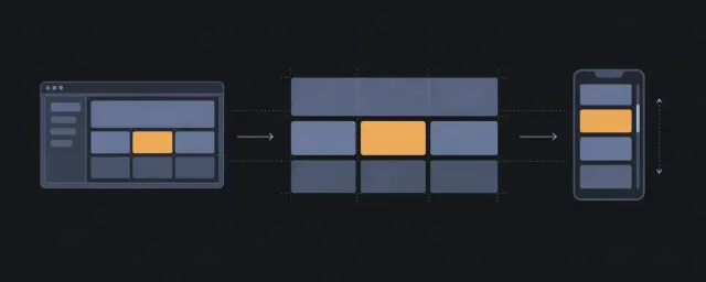
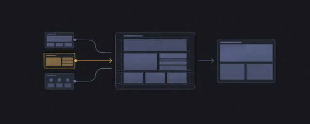
Place header, footer, sidebars, and main content in a resilient shell.
이 자료로 구현하기
원문 주소와 버전이 포함된 요청문입니다. 복사한 뒤 만들 화면과 요구사항을 채워 에이전트에게 전달하세요.
TRY THE PATTERN
너비가 달라지면 어떻게 될까요?
원문의 HTML·CSS로 실행합니다. 색과 테두리는 영역을 구분하기 위한 예시입니다.
FROM PRINCIPLE TO PRACTICE
이 원리로 만든 예제 1
예제를 열어 직접 조작하고, 관찰한 동작을 이 문서의 원리와 비교해 보세요.
holy-grail
- 원문 HTML과 CSS의 실제 배치
영역 너비와 글 방향을 바꿔 줄바꿈, 수축, 스크롤 주체를 확인합니다. 원문 스니펫을 그대로 실행합니다.
- 원문 HTML과 CSS의 실제 배치
When To Use
Use this pattern when you need to place header, footer, sidebars, and main content in a resilient shell.
HTML
<section class="holy_grail" aria-label="News page">
    <header class="holy_grail_header">Daily briefing</header>
    <aside class="holy_grail_left">Topic navigation</aside>
    <main class="holy_grail_main">Lead story and article stream</main>
    <aside class="holy_grail_right">Market snapshot</aside>
    <footer class="holy_grail_footer">Edition links</footer>
</section>
CSS
.holy_grail {
    display: grid;
    gap: 1rem;
    grid-template: "header header header" auto "left main right" 1fr "footer footer footer" auto / minmax(12rem, auto) 1fr minmax(12rem, auto);
    min-block-size: 100dvh;
}

.holy_grail_header {
    grid-area: header;
}

.holy_grail_left {
    grid-area: left;
}

.holy_grail_main {
    grid-area: main;
    min-inline-size: 0;
}

.holy_grail_right {
    grid-area: right;
}

.holy_grail_footer {
    grid-area: footer;
}
Core Properties
display,gap,grid-template,min-block-size,grid-area,min-inline-sizedefine the spatial behavior for this pattern.
Properties That Break The Layout If Removed
- Removing
display,gap,grid-template,min-block-size,grid-area,min-inline-sizechanges the pattern from its documented layout responsibility back toward ordinary flow or an unsafe fixed arrangement.
Constraints And Change Points
- breakpointed responsiveness is part of the contract; change sizing values only when the new minimum, maximum, or wrap point is documented with the pattern.
- Keep the HTML class hooks and CSS selectors in one-to-one agreement.
Scroll Ownership
No internal scroll container.
Accessibility And Source Order Notes
- Semantic role expectation: Preserve the HTML sample's landmark, list, navigation, form, figure, or article roles; layout classes must not replace semantic elements.
- DOM order expectation: Keep semantic elements, DOM order, reading order, and focus order independent from the visual placement created by the layout classes.
- Focus risk: Any interactive descendants follow DOM order; do not use this pattern to create a visual order that keyboard focus cannot follow.
- Scroll expectation: No internal scroll container.
- Cognitive risk: Low: the pattern should preserve ordinary reading flow when semantic order is already correct.
Browser And Fallback Notes
The CSS uses modern grid, flex, intrinsic sizing, logical properties, or positioning. If a target browser cannot support a property, fall back to ordinary block flow before adding decorative or script-driven layout behavior.
Composition Notes
Use holy_grail as the stable pattern root and compose additional layout behavior outside that root unless the child class is part of the documented relationship.
Anti-patterns
- Do not add color, border, shadow, typography, or animation rules to reusable pattern CSS.
- Do not use this pattern to repair unclear HTML structure; make the DOM roles legible first.
IA Navigation
Parent: Viewport / Shell patterns in Pattern Categories. Next: Layout Recipes for screen-level composition, or return to the Layout Pattern Catalog when choosing another primitive.