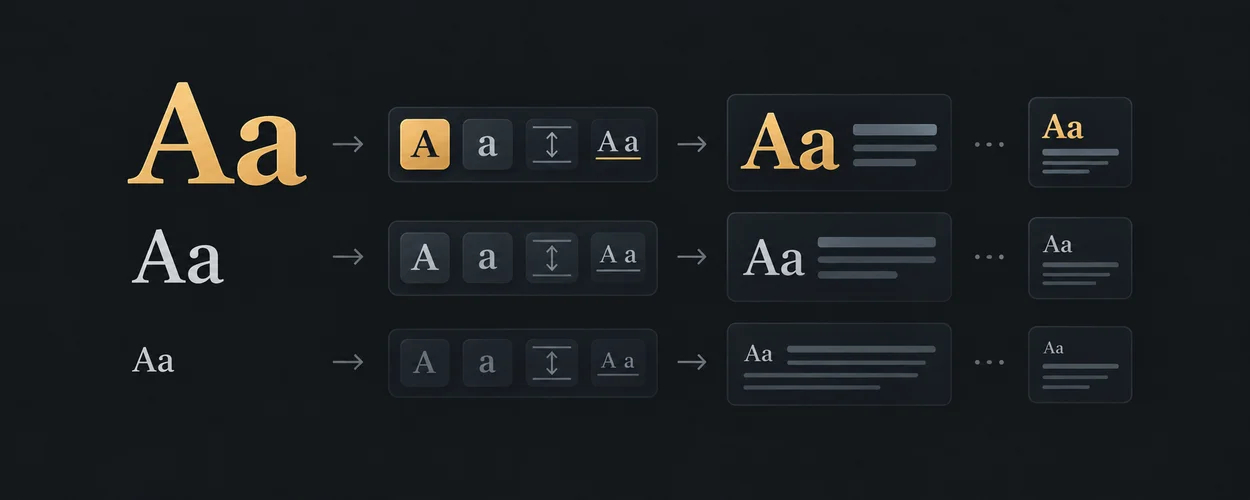
사용자 접근성 설정에 맞추기
Preferences And Accessibility Across Platforms
글자 확대, 모션 감소, 대비와 투명도를 각각의 설정으로 다룹니다.
이 자료로 구현하기
원문 주소와 버전이 포함된 요청문입니다. 복사한 뒤 만들 화면과 요구사항을 채워 에이전트에게 전달하세요.

Primary role: comparative preference and accessibility adaptation guide.
Repository Boundary
This guide compares what named platforms expose and the questions a consumer must answer. Shared accessibility evidence governs conformance. Product color, typography, transparency, and motion remain consumer-owned; this page supplies no visual defaults to Layout.
Reusable Method
Inventory each preference as a separate input. Name its source, application override policy, affected components, and update behavior. Specify a usable base presentation for targets that do not expose a particular signal. Then test meaningful combinations rather than treating “accessibility mode” as one boolean.
Source Findings
| Source | Bounded finding | Transfer boundary |
|---|---|---|
| Apple HIG accessibility | The guidance addresses larger text, VoiceOver descriptions, multiple information channels, and response to Reduce Motion. | Native support depends on the implementation; a web font choice does not implement Dynamic Type. |
| Apple HIG materials | Material behavior can respond to appearance and accessibility settings, including transparency and contrast. | A CSS blur copied from a screenshot does not inherit native material behavior. |
| Android Compose accessibility | Compose exposes semantics and accessibility support that custom components must preserve. | A drawn label is not by itself an accessibility semantic node. |
| Windows contrast themes | Contrast themes use system color roles and can change while an app runs. | A single hard-coded dark palette is not the Windows contrast-theme contract. |
| Media Queries Level 5 | Color scheme, reduced motion, contrast, and reduced transparency are separate preference features. | Support must be checked per feature and target; one query does not imply another. |
| CSS Color Adjustment | Forced colors can replace author colors with a user-selected palette and adjust effects. | Preserve meaningful distinctions when author decoration changes or disappears. |
Read on 2026-09-21. Apple documentation bodies were inspected through the official documentation JSON. These living platform pages and standards-track publications are dated readings, not proof that all named features exist in a selected OS/browser release.
Preference Resolution
Record “follow system” separately from an explicit in-product selection. Define which setting currently determines the presentation and how users return to system behavior. Do not use one persisted theme name to infer motion, contrast, or text-size preferences.
For web forced colors, verify semantic system-color pairings and visible boundaries rather than preserving brand appearance at any cost. Any local exception to automatic color adjustment needs a stated reason and target evidence. For reduced transparency without a supported media feature, the base surface still needs to make its content legible.
Text Scaling Is A Behavior Change
Reflow concerns preserving information and function when content is presented in a narrow equivalent viewport, with scoped exceptions. Text Spacing concerns loss of content or function when users override specified spacing. Neither criterion means that every interface must have the same default type scale.
Local proposal: treat text scaling as a reason to reconsider composition, not merely multiply font sizes. A toolbar can need wrapping or a different command presentation; a dialog may need a scrollable reading area; a short title can become several lines. Those spatial choices go to Layout, while label priorities and command availability stay in the product.
Combination Matrix
| Combination | Failure to probe | Observable result to retain |
|---|---|---|
| Dark appearance with forced colors | The app assumes its dark palette remains authoritative. | Text, selection, links, and focus remain distinguishable. |
| Larger text with compact window | Fixed control bounds clip names or actions. | Full task remains possible without losing required information. |
| Reduced motion during pending work | The indicator disappears without an equivalent waiting state. | Pending and completed states remain understandable. |
| Reduced transparency over rich content | A custom surface depends on blur alone for separation. | Foreground content remains legible with the chosen fallback. |
| Screen reader with changing result set | Decorative text changes lack meaningful semantics. | The selected task and concise result status are exposed correctly. |
| Runtime preference change | Only newly mounted components update. | Existing dialogs, portals, and embedded surfaces follow their declared policy. |
These are proposed probes, not a statement that all combinations are exposed by every OS. Record unavailable combinations as not applicable with a reason.
Opinionated Guidance
Make preference ownership explicit and keep the base experience usable. Avoid adding a single “accessible theme” that quietly overrides unrelated preferences. Use product settings to provide clear user control where platform signals are absent or insufficient.
Platform-Specific Guidance
Native text scaling, browser zoom, author font settings, and OS display scaling can affect different layers. Name which mechanism was changed in a test. Likewise, simulated CSS media features establish a code path, while an actual OS setting additionally exercises host integration.
Use Accessible Motion for motion replacement and Typography Semantics for source-specific type-style meanings.
Unsupported Absolutes
Dark mode is not forced colors. A contrast preference is not a contrast measurement. Removing blur does not guarantee legibility. Passing one text-size case does not prove all localization and scaling combinations.
Verification Contract
Record the actual system setting, application override, media/API observation, and effective component state. Test before load and while a dialog or asynchronous operation is active. Compare semantic and visual evidence for the same state; do not substitute an accessibility-tree snapshot for an announcement test.
This documentation defines unexecuted cases. It makes no native accessibility or browser conformance claim. Re-review when a source, preference-resolution rule, or target platform changes.
Source, License, And Attribution
Locally authored synthesis of the linked first-party sources, inspected 2026-09-21. No platform values or assets are imported. consumer_reference: not_applicable because no consumer preference or profile record is selected.
IA Navigation
Parent: Platform Guides. Next: Input And Focus.