A FIELD GUIDE FOR INTERFACES
Expression
用于品牌研究与展示的表现方向、质感、渐变与 WebGL 技法。
按想做的事搜索,再接着阅读英文原文。
按领域浏览
没有资料匹配全部关键词,下面是部分匹配的资料。也可以看看 按任务的阅读顺序。
list-detail
Place an explorable list beside its detail region.
Motion Interaction Recipes
State-based product motion recipes for feedback, disclosure, modal transitions, rearrangement, progress, and dragging.
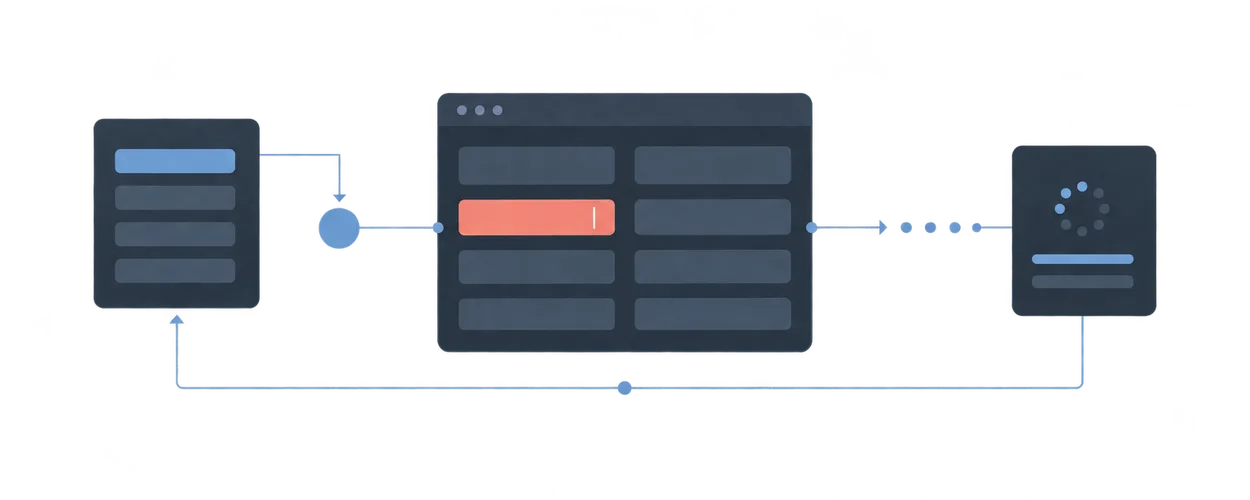
Latest Request Wins
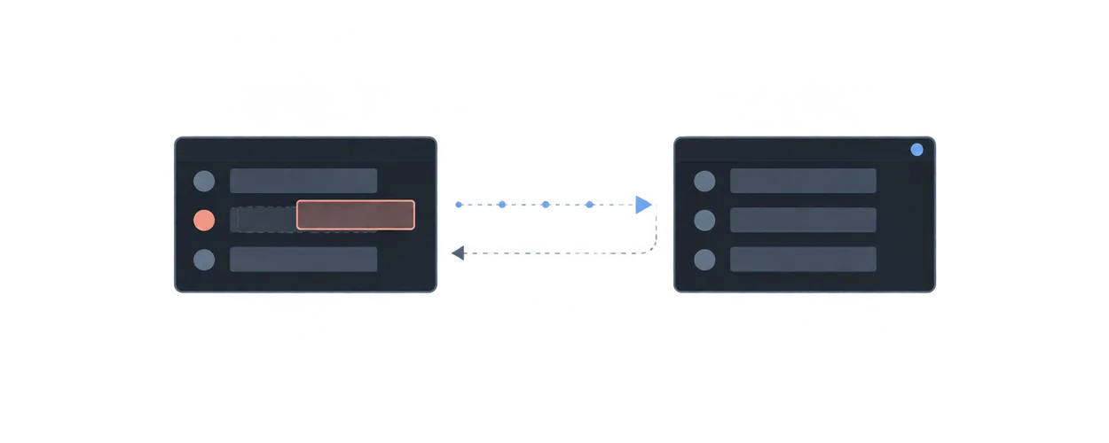
Prevent an older read response from replacing the result of a newer user intent.
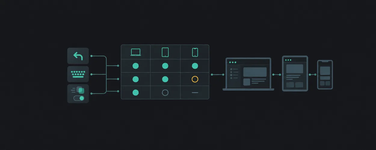
Platform Compatibility Matrix
Separate transferable interaction intent from platform capabilities, target fallbacks, and required evidence.
Cross-System Term Cases
Directly sourced terms and scoped relations for values, token resolution, interaction semantics, typography, components, and historical formats.
Nocturne Editorial Direction
A dark, glowing, editorial direction with concrete type, color, texture, and motion-density values.
Layout
Motion
Design Engineering
Platform Guides
Design Terminology
Expression
Layout Planning Guide
Pre-design entry point for choosing and composing StyleGallery Layout patterns.
Motion Vocabulary
Evidence-bounded method and reference for naming observable interface motion.
Interface Craft Decisions
Repository-bounded method for purpose, implementation, review, and evidence decisions at the product layer.
Apple Interaction As A Comparative Reference
Bounded comparison of Apple interaction themes with explicit web-adaptation and provenance limits.
Design Source Kinds
Classification of vocabulary sources into design system, platform guideline, specification, design tool, pattern library, and brand style guide kinds.
Expression Direction Brief
Decide what a finished page should feel like, with concrete values, before building it.
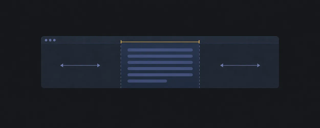
center
Center a block while respecting a maximum measure.
Motion Review Workflow
Evidence-first workflow for reviewing product-layer motion without changing Layout policy.
Consumer Migration Readiness
Evidence-bound method for deciding whether a consumer migration preserves its declared behavior.
Platform Adaptation Workflow
Compare a native convention with a target implementation through source, capability, fallback, and evidence records.
Design Source Vocabularies
Freshness-bounded inventory of named vocabulary sources with source kind, vocabulary surface, version boundary, and review status.
Brand Studies
Rules for unofficial reinterpretations of real brands in showcase works.
super-center
Center one region along both axes.
Motion Practice Reference
Bounded motion mechanics, heuristics, platform notes, and verification requirements.
Design Engineering Reference Profiles
Android Interaction As A Comparative Reference
Source-bounded Android Back and adaptive-window guidance with explicit web translation and failure cases.
Design Concept Families
Classification of design terms into foundation, interface-artifact, guidance, governance, consumption, and tooling-construct concept families.
Warm Print Direction
A light, warm, print-inspired direction with concrete type, color, texture, and motion-density values.
box
Wrap content with predictable internal spacing.
Motion Decision Tree
Choose a motion responsibility from a user task, state change, and failure case.
Governed Local Reference Profiles
Windows Interaction As A Comparative Reference
Source-bounded Windows keyboard, focus, and command guidance with web adaptation cases.
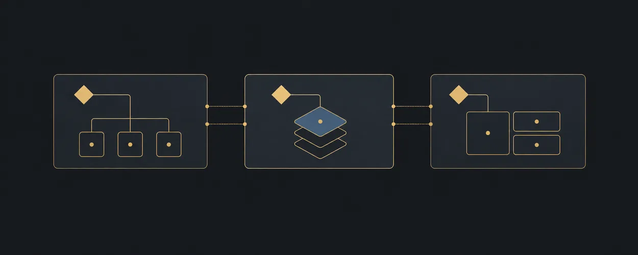
Design Term Relations
Typed semantic relation model between design terms from different named sources, and the term record shape.
Gradient Atmosphere
Copy-ready blurred gradient fields, card glows, and gradient text for expressive product pages.
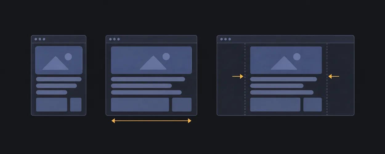
clamped-card
Constrain a card to a readable fluid width.
Motion Brief
Author a product-owned transition contract with interruption, preference, and evidence requirements.
External Consumer Adaptation
Adaptive Navigation Across Platforms
Compare window adaptation, modal presentation, and Back ownership while preserving task identity across native and web surfaces.
Design Term Comparison Workflow
Resolve source-specific terminology questions with a scoped relation, explicit uncertainty, and a reusable handoff.
Grain And Texture
Copy-ready film grain, noise, and halftone textures without image files.
content-limiter
Keep prose width readable inside fluid containers.
Observed Choreography Transcription
Transcribe an observed scroll choreography into Scene Composition Contract vocabulary without copying assets or claiming implementation knowledge.
Design Engineering Decision Tree
Route product craft work from the uncertain decision to a contract, example, and appropriate evidence.
Preferences And Accessibility Across Platforms
Compare text scaling, motion, contrast, transparency, and accessibility semantics without collapsing distinct user preferences.
Token Semantics And Resolution
Compare semantic roles, references, groups, resolver contexts, and runtime values without treating their names as interchangeable.
WebGL Hero Field
A three.js point field behind a hero, with pointer parallax, offscreen pausing, and safe fallbacks.
fluid-styles
Let a region fill available width without exceeding a readable max.
Accessible Motion And Equivalent Feedback
Separate motion preferences, automatic updates, flashing, and semantic feedback before designing reduced-motion behavior.
Component Contract
Define product component semantics, states, events, asynchronous ownership, and verification before visual treatment.
Input And Focus Across Platforms
Compare keyboard, pointing, dragging, focus, and target conventions using named native and web contracts.
Dialog And Popover Semantics
Separate native component names, HTML presentation behavior, ARIA semantics, and product interaction contracts.
card-grid
Align repeating cards in rows and columns.
Interruption And Retargeting
Keep semantic intent, presented motion, cancellation, and teardown consistent under repeated input.
Design Engineering Worked Examples
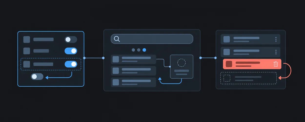
Apply component contracts to settings, asynchronous search, and destructive list actions with explicit recovery cases.
Typography Roles, Styles, And Representations
Compare named type roles, native scaling behavior, composite token records, and CSS output without inventing universal size mappings.
columns
Flow long content into balanced text columns.
Motion Rendering And Performance
Diagnose animation cost and choose native transition mechanisms with measurable behavior and complete fallbacks.
State Management Decision Tree
Route UI state problems to the smallest ownership or transition contract.
dense-grid
Fill a compact grid with repeated small items.
Scroll Choreography Technique
Copy-ready GSAP ScrollTrigger and Lenis setup, pinned horizontal travel, scrubbed scenes, and a native CSS scroll-timeline equivalent.
State Management
grid-wrapper
Center grid tracks while allowing full-width breakout tracks.
Kinetic Type Technique
Copy-ready split-word headline rises, scroll-lit paragraphs, count-ups, and marquees that keep accessible text intact.
Derived State From Authoritative Inputs
Prevent totals, filtered lists, and dirty flags from drifting away from their inputs.
masonry-approx
Approximate staggered content with columns when exact row alignment is not needed.
Draft And Persisted Baseline
Preserve editable work while distinguishing it from the last acknowledged saved value.
page-grid
Align page content to margins, gutters, and a central track.
Selection By Stable Identity
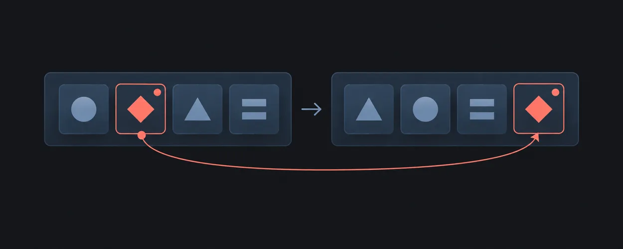
Keep selection attached to an entity while a collection reorders or refreshes.
ram-grid
Repeat items into as many useful columns as space allows.
Identity Boundary And Reset
Prevent temporary state and pending outcomes from leaking across entity or account changes.
twelve-span-grid
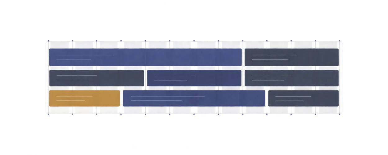
Provide a twelve-column placement scaffold.
Optimistic Overlay And Recovery
Show a speculative change while preserving an authoritative base for recovery.
badge-list
Align item labels with trailing counts.
Single Flight And Duplicate Submission
Apply an explicit policy to repeated activation of one pending operation.
breadcrumb
Lay out hierarchy links compactly with wrapping.
Single Owner And Controlled Inputs
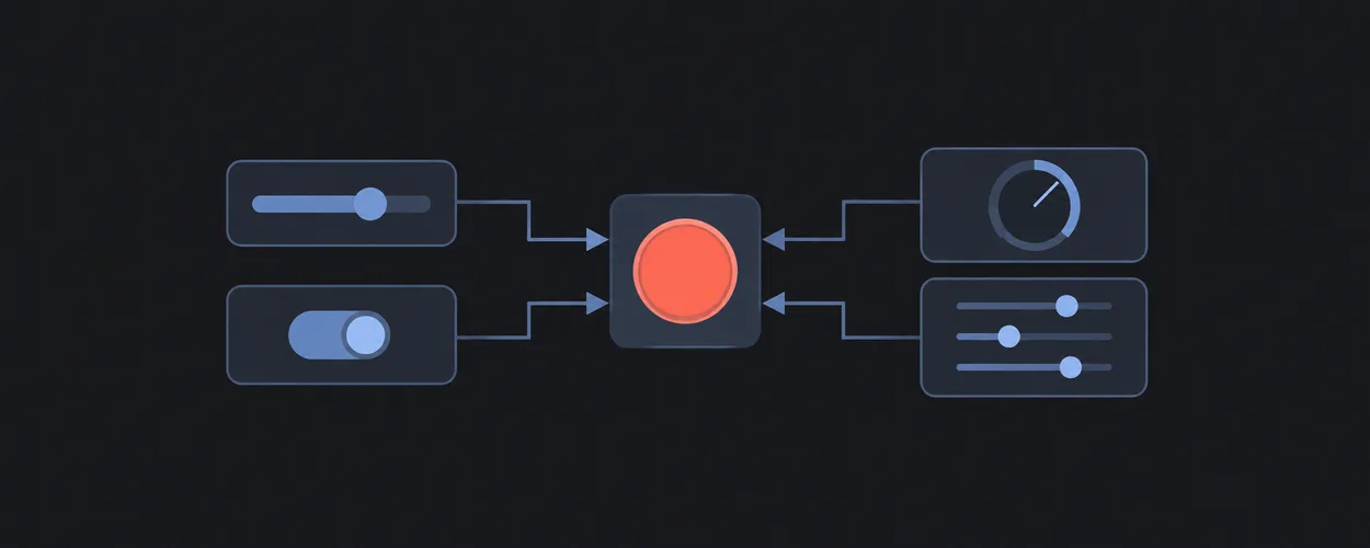
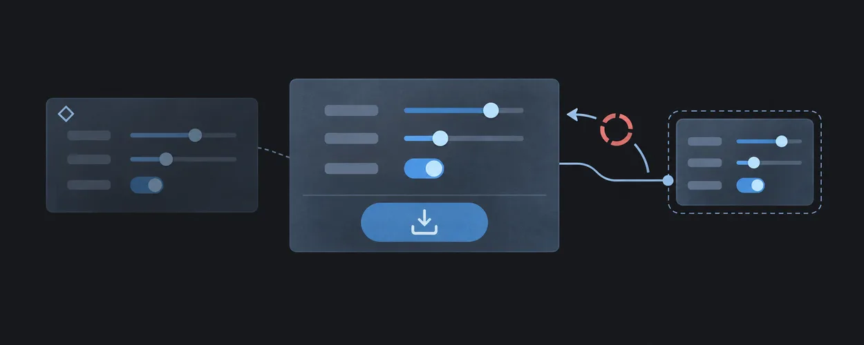
Keep one authoritative value when several controls edit the same setting.
cluster
Keep related items together while allowing wrapping.
Submitted Snapshot And Save Acknowledgement
Keep later edits dirty when an earlier submitted snapshot finishes saving.
deconstructed-pancake
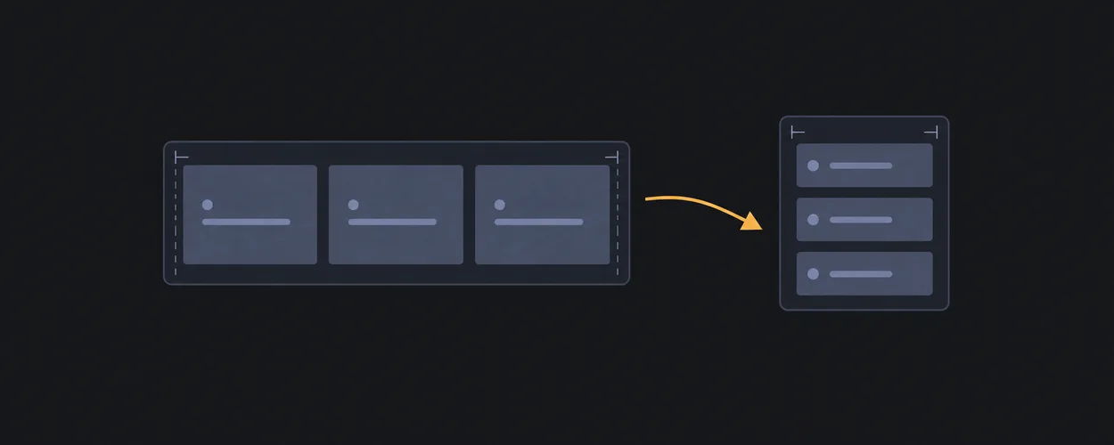
Let equal cards stretch in a row and stack naturally when narrow.
Unsaved Changes And Navigation
Make leaving an edited screen an explicit decision without losing the current draft.
pagination
Lay out page controls as a bounded wrapping row.
URL State And History
Keep shareable screen state consistent across links, refresh, and browser history.
reel
Let a row scroll horizontally instead of wrapping.
Versioned And Scoped State Restore
Restore persisted preferences only when their schema and ownership scope are valid.
split-nav
Separate primary and secondary nav actions in one row.
Deletion And Supported Undo
Remove the intended entity and provide recovery that matches actual backend capabilities.
tab-strip
Keep peer tabs in one stable row that can wrap.
State Management Recipes
wrap-row
Wrap controls into rows with stable gaps.
Multi-Step Form With Retained Draft
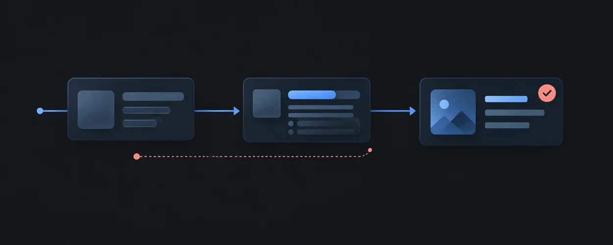
Retain entered values across steps and guard progression and final submission.
frame
Preserve media aspect ratio in a responsive slot.
Search Filters And Detail Selection
Preserve query context and entity identity across asynchronous search and history navigation.
icon-frame
Keep an icon aligned inside a fixed square slot.
Settings With Explicit Save
Edit and save preferences without losing later input or leaving with unsaved work.
imposter
Place an overlay region over a parent without changing document order.
State Management Brief
Record authority, transitions, effects, lifetime, and acceptance cases before implementation.
overlay-stack
Stack several regions into the same grid cell.
State Management Verification Matrix
Test event ordering, failure recovery, navigation, and identity boundaries separately from UI presentation.
main-with-rail
Keep primary content dominant with a narrow secondary rail.
Native Interaction Contracts
Choose disclosure, dialog, popover, menu, and combobox behavior by semantics, focus, dismissal, and input ownership.
media-object
Align media and descriptive content as a stable pair.
Text Input And Internationalization
Design composition-aware editing, explicit text units, bidirectional content, and locale-bound presentation without corrupting user input.
sidebar
Let a narrow sidebar and wider content wrap when space is tight.
Loading, Progress, And Feedback
Separate input acknowledgement, pending work, stale content, confirmed completion, and measurable responsiveness.
split-screen
Split a viewport or region into two balanced panes.
sticky-aside
Keep related aside content visible during long reads.
supporting-pane
Keep supplemental information beside a primary task.
switcher
Switch equal regions from row to stack without a viewport breakpoint.
feed
Stack repeated content items with stable rhythm.
line-up
Keep card footer actions aligned at the bottom.
stack
Create consistent vertical rhythm between direct children.
step-nav
Present sequential steps with consistent vertical rhythm.
cover
Keep a central region balanced between optional header and footer.
fixed-sidenav-shell
Keep side navigation stable while main content scrolls.
holy-grail
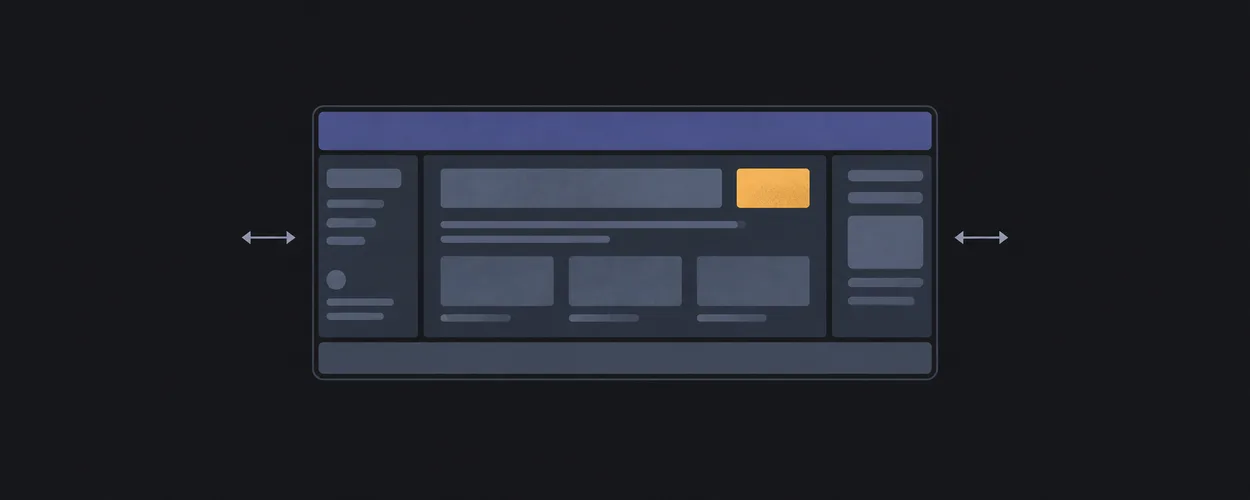
Place header, footer, sidebars, and main content in a resilient shell.
panel-layout
Create predictable main and utility panels.
scroll-body-shell
Keep shell regions fixed while only the body scrolls.
sticky-footer
Keep footer at the bottom when content is short.
sticky-header
Keep a header visible above a scrolling content region.
Article Page
Compose readable prose with optional supporting aside content.
Command Surface
Compose a tool-heavy shell with stable command and content regions.
Dashboard
Compose repeated panels and action clusters on a page grid.
Form Flow
Compose sequential form content with constrained width and reachable actions.
Homepage
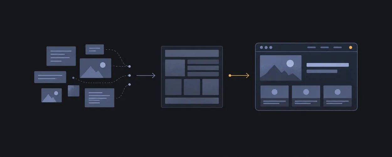
Compose raw content into a homepage or ordinary webpage before product-level visual styling.
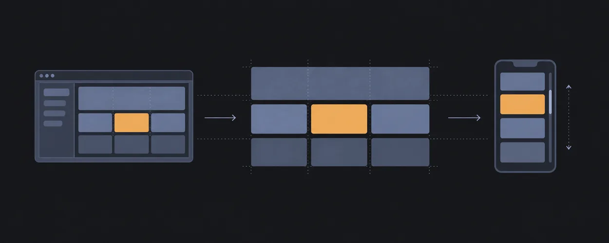
List Detail
Compose an explorable list beside its selected detail region.
Primitive To Recipe Matrix
Matrix that explains which layout primitives each screen recipe uses, why the slot exists, and what risk follows from substitution.
SaaS Settings
Compose a fixed side navigation with a constrained settings flow.
Layout Decision Tree
Question-driven route from screen constraints to StyleGallery Layout patterns and recipes.
Documentation Mode Taxonomy
Primary documentation modes, hybrid decisions, and task routing for StyleGallery.
Layout Brief Template
Questions to answer before selecting a layout pattern stack.
Controlled Vocabulary
Canonical terminology, aliases, deprecated terms, and scannability rules for StyleGallery.
Webpage Generation Workflow
Intake-to-implementation workflow for turning raw content into a homepage or ordinary webpage layout.







































































收藏本页,需要时就能再次找到。